Варианты эффекта CSS увеличение изображений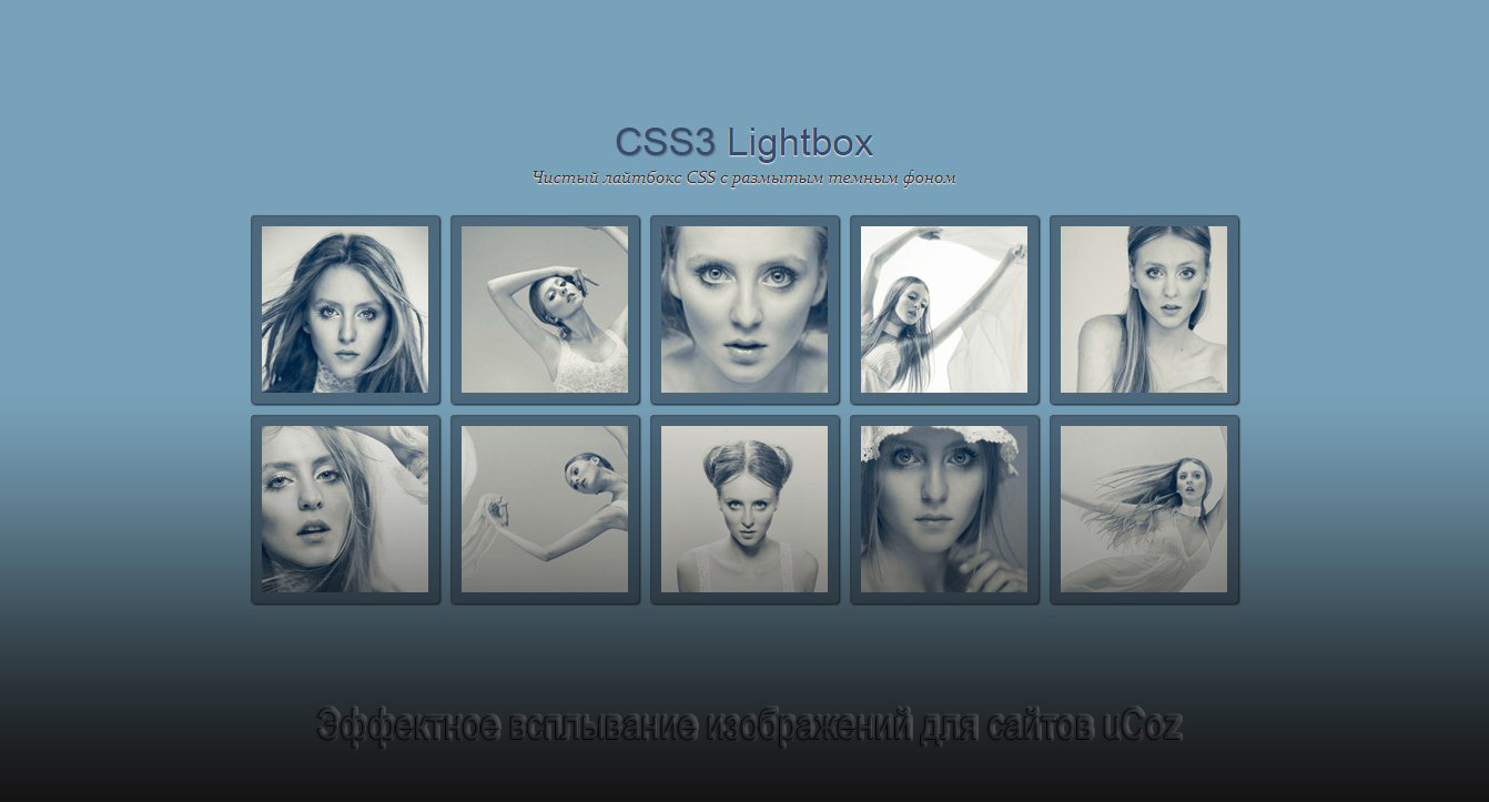 | |
| Оригинальное решение на 2 варианта для эффективного появление изображений, где происходит эффект в реализации на сайтах разных систем. Но здесь данное решение эффекта по умолчанию было настроено на другой CMS, но сам понятен, что многим понравится, но что бы не тратить время под настройку конструктора uCoz, то код был реализован для сайта системы uCoz. Где автор объясняет, что потратил много времени для переписки кода, надеясь на то, что вам понравится сама идея с плавным появлением картинки. Ведь теперь нам не нужно переписывать коды, а скопировать их, с последствием установки по месту. Здесь представлено два варианта стильных эффектов, которые реализованы в модуле фотоальбом, плюс сам вид фотоальбома. Но здесь зависит от вашего решение, где если захотите, то можете перестроить под другой модуль, который вам нужно наблюдать. Здесь мы выстраиваем картинки под небольшой размер, но при клике они увеличиваются, и с увеличением появляется название, а также краткое описание. При открытие страницы и изображениями:  Так выглядит снимок при его просмотре в реальном размере:  Теперь установочный процесс: Первым делом нужно скачать архив и загрузите папку img в файловый менеджер вашего сайта. В данной папке находятся функционал для увеличение, а также картинки, которые закреплены за первым и вторым вариантом. Пример эффекта №1 Важно: Этот вид материала идёт как для первого примера, так и для второго варианта. Вид материалов фотоальбома: Вставьте ниже приведённый код в вид материала фотоальбома. HTML Код <ul class="lb-album"> <li> <a href="#$FULL_PHOTO_DIRECT_URL$"> <img src="$FULL_PHOTO_DIRECT_URL$" width="150" height="150"> <span><img src="/img/zuma.png" style="margin: 73px auto;" border="0" alt="" /></span> </a> <div class="lb-overlay" id="$FULL_PHOTO_DIRECT_URL$"> <a href="#page" class="lb-close">x Close</a> <a href="$PHOTO_URL$"><img src="$FULL_PHOTO_DIRECT_URL$"/></a> <div> <p><a href="$PHOTO_URL$">$PHOTO_NAME$</a></p> </div> </div> </li> </ul> CSS Код .lb-album li{ list-style:none; float: left; margin: 5px; position: relative; } .lb-album li > a, .lb-album li > a img{ display: block; } .lb-album li > a{ width: 150px; height: 150px; position: relative; padding: 10px; background: #f1d2c2; -webkit-box-shadow: 1px 1px 2px #fff, 1px 1px 2px rgba(158,111,86,0.3) inset; -moz-box-shadow: 1px 1px 2px #fff, 1px 1px 2px rgba(158,111,86,0.3) inset; box-shadow: 1px 1px 2px #fff, 1px 1px 2px rgba(158,111,86,0.3) inset; -moz-border-radius: 4px; -webkit-border-radius: 4px; border-radius: 4px 4px 4px 4px; } .lb-album li > a span{ position: absolute; width: 150px; height: 150px; top: 10px; left: 10px; text-align: center; line-height: 150px; color: rgba(27,54,81,0.8); text-shadow: 0px 1px 1px rgba(255,255,255,0.6); font-size: 24px; opacity: 0; filter: alpha(opacity=0); /* internet explorer */ -ms-filter:"progid:DXImageTransform.Microsoft.Alpha(opacity=0)"; /*IE8*/ background: rgb(241,210,194); background: -moz-radial-gradient(center, ellipse cover, rgba(255,255,255,0.56) 0%, rgba(241,210,194,1) 100%); background: -webkit-gradient(radial, center center, 0px, center center, 100%, color-stop(0%,rgba(255,255,255,0.56)), color-stop(100%,rgba(241,210,194,1))); background: -webkit-radial-gradient(center, ellipse cover, rgba(255,255,255,0.56) 0%,rgba(241,210,194,1) 100%); background: -o-radial-gradient(center, ellipse cover, rgba(255,255,255,0.56) 0%,rgba(241,210,194,1) 100%); background: -ms-radial-gradient(center, ellipse cover, rgba(255,255,255,0.56) 0%,rgba(241,210,194,1) 100%); background: radial-gradient(center, ellipse cover, rgba(255,255,255,0.56) 0%,rgba(241,210,194,1) 100%); -webkit-transition: opacity 0.3s linear; -moz-transition: opacity 0.3s linear; -o-transition: opacity 0.3s linear; -ms-transition: opacity 0.3s linear; transition: opacity 0.3s linear; } .lb-album li > a:hover span{ opacity: 1; filter: alpha(opacity=99); /* internet explorer */ -ms-filter:"progid:DXImageTransform.Microsoft.Alpha(opacity=99)"; /*IE8*/ } .lb-overlay{ width: 0px; height: 0px; position: fixed; overflow: hidden; left: 0px; top: 0px; padding: 0px; z-index: 99; text-align: center; background: rgb(241,210,194); background: -moz-radial-gradient(center, ellipse cover, rgba(255,255,255,0.56) 0%, rgba(241,210,194,1) 100%); background: -webkit-gradient(radial, center center, 0px, center center, 100%, color-stop(0%,rgba(255,255,255,0.56)), color-stop(100%,rgba(241,210,194,1))); background: -webkit-radial-gradient(center, ellipse cover, rgba(255,255,255,0.56) 0%,rgba(241,210,194,1) 100%); background: -o-radial-gradient(center, ellipse cover, rgba(255,255,255,0.56) 0%,rgba(241,210,194,1) 100%); background: -ms-radial-gradient(center, ellipse cover, rgba(255,255,255,0.56) 0%,rgba(241,210,194,1) 100%); background: radial-gradient(center, ellipse cover, rgba(255,255,255,0.56) 0%,rgba(241,210,194,1) 100%); } .lb-overlay > div{ position: relative; color: rgba(27,54,81,0.8); opacity: 0; filter: alpha(opacity=0); /* internet explorer */ -ms-filter:"progid:DXImageTransform.Microsoft.Alpha(opacity=0)"; /*IE8*/ width: 550px; margin: 10px auto 0px auto; text-shadow: 0px 1px 1px rgba(255,255,255,0.6); -webkit-transition: opacity 0.3s linear 1.3s; -moz-transition: opacity 0.3s linear 1.3s; -o-transition: opacity 0.3s linear 1.3s; -ms-transition: opacity 0.3s linear 1.3s; transition: opacity 0.3s linear 1.3s; } .lb-overlay div h3, .lb-overlay div p{ padding: 0px 20px; width: 200px; height: 60px; } .lb-overlay div h3{ font-size: 36px; float: left; text-align: right; border-right: 1px solid rgba(27,54,81,0.4); } .lb-overlay div h3 span, .lb-overlay div p{ font-size: 16px; font-family: Constantia, Palatino, "Palatino Linotype", "Palatino LT STD", Georgia, serif; font-style: italic; } .lb-overlay div h3 span{ display: block; line-height: 6px; } .lb-overlay div p{ text-align: left; float: left; width: 260px; } .lb-overlay a.lb-close{ background: rgba(27,54,81,0.8); z-index: 1001; color: #fff; position: absolute; top: 43px; left: 50%; font-size: 15px; line-height: 26px; text-align: center; width: 50px; height: 23px; overflow: hidden; margin-left: -25px; opacity: 0; filter: alpha(opacity=0); /* internet explorer */ -ms-filter:"progid:DXImageTransform.Microsoft.Alpha(opacity=0)"; /*IE8*/ -webkit-box-shadow: 0px 1px 2px rgba(0,0,0,0.3); -moz-box-shadow: 0px 1px 2px rgba(0,0,0,0.3); box-shadow: 0px 1px 2px rgba(0,0,0,0.3); -webkit-transition: opacity 0.3s linear 1.2s; -moz-transition: opacity 0.3s linear 1.2s; -o-transition: opacity 0.3s linear 1.2s; -ms-transition: opacity 0.3s linear 1.2s; transition: opacity 0.3s linear 1.2s; } .lb-overlay img{ /* height: 100%; For Opera max-height does not seem to work */ max-height: 100%; position: relative; -webkit-box-shadow: 1px 1px 4px rgba(0,0,0,0.3); -moz-box-shadow: 1px 1px 4px rgba(0,0,0,0.3); box-shadow: 0px 2px 7px rgba(0,0,0,0.2); } .lb-overlay:target { width: auto; height: auto; bottom: 0px; right: 0px; padding: 80px 100px 120px 100px; } .lb-overlay:target img { -webkit-animation: fadeInScale 1.2s ease-in-out; -moz-animation: fadeInScale 1.2s ease-in-out; -o-animation: fadeInScale 1.2s ease-in-out; -ms-animation: fadeInScale 1.2s ease-in-out; animation: fadeInScale 1.2s ease-in-out; } .lb-overlay:target a.lb-close, .lb-overlay:target > div{ opacity: 1; filter: alpha(opacity=99); /* internet explorer */ -ms-filter:"progid:DXImageTransform.Microsoft.Alpha(opacity=99)"; /*IE8*/ } @-webkit-keyframes fadeInScale { 0% { -webkit-transform: scale(0.6); opacity: 0; } 100% { -webkit-transform: scale(1); opacity: 1; } } @-moz-keyframes fadeInScale { 0% { -moz-transform: scale(0.6); opacity: 0; } 100% { -moz-transform: scale(1); opacity: 1; } } @-o-keyframes fadeInScale { 0% { -o-transform: scale(0.6); opacity: 0; } 100% { -o-transform: scale(1); opacity: 1; } } @-ms-keyframes fadeInScale { 0% { -ms-transform: scale(0.6); opacity: 0; } 100% { -ms-transform: scale(1); opacity: 1; } } @keyframes fadeInScale { 0% { transform: scale(0.6); opacity: 0; } 100% { transform: scale(1); opacity: 1; } } /* 100% Height for Opera as the max-height seems to be ignored, not optimal for large screens http://bricss.net/post/11230266445/css-hack-to-target-opera */ x:-o-prefocus, .lb-overlay img { height: 100%; } Установочный процесс для первого варианта завершен. Пример эффекта №2 Если вам второй вариант понравился больше то вставьте вот эти стили в самый низ стилей вашего сайта. CSS Код .lb-album li{ list-style:none; float: right; margin: 5px; position: relative; } .lb-album li > a, .lb-album li > a img{ display: block; } .lb-album li > a{ width: 150px; height: 150px; position: relative; padding: 10px; background: #f1d2c2; -webkit-box-shadow: 1px 1px 2px #fff, 1px 1px 2px rgba(158,111,86,0.3) inset; -moz-box-shadow: 1px 1px 2px #fff, 1px 1px 2px rgba(158,111,86,0.3) inset; box-shadow: 1px 1px 2px #fff, 1px 1px 2px rgba(158,111,86,0.3) inset; -webkit-border-radius: 4px; -moz-border-radius: 4px; border-radius: 4px 4px 4px 4px; } .lb-album li > a span{ position: absolute; width: 150px; height: 150px; top: 10px; left: 10px; text-align: center; line-height: 150px; color: rgba(27,54,81,0.8); text-shadow: 0px 1px 1px rgba(255,255,255,0.6); font-size: 24px; opacity: 0; filter: alpha(opacity=0); /* internet explorer */ -ms-filter:"progid:DXImageTransform.Microsoft.Alpha(opacity=0)"; /*IE8*/ background: rgb(241,210,194); background: -moz-radial-gradient(center, ellipse cover, rgba(255,255,255,0.56) 0%, rgba(241,210,194,1) 100%); background: -webkit-gradient(radial, center center, 0px, center center, 100%, color-stop(0%,rgba(255,255,255,0.56)), color-stop(100%,rgba(241,210,194,1))); background: -webkit-radial-gradient(center, ellipse cover, rgba(255,255,255,0.56) 0%,rgba(241,210,194,1) 100%); background: -o-radial-gradient(center, ellipse cover, rgba(255,255,255,0.56) 0%,rgba(241,210,194,1) 100%); background: -ms-radial-gradient(center, ellipse cover, rgba(255,255,255,0.56) 0%,rgba(241,210,194,1) 100%); background: radial-gradient(center, ellipse cover, rgba(255,255,255,0.56) 0%,rgba(241,210,194,1) 100%); -webkit-transition: opacity 0.3s linear; -moz-transition: opacity 0.3s linear; -o-transition: opacity 0.3s linear; -ms-transition: opacity 0.3s linear; transition: opacity 0.3s linear; } .lb-album li > a:hover span{ opacity: 1; filter: alpha(opacity=99); /* internet explorer */ -ms-filter:"progid:DXImageTransform.Microsoft.Alpha(opacity=99)"; /*IE8*/ } .lb-overlay{ width: 0px; height: 0px; position: fixed; overflow: hidden; left: 0px; top: 0px; padding: 0px; z-index: 99; text-align: center; background: rgb(241,210,194); background: -moz-radial-gradient(center, ellipse cover, rgba(255,255,255,0.56) 0%, rgba(241,210,194,1) 100%); background: -webkit-gradient(radial, center center, 0px, center center, 100%, color-stop(0%,rgba(255,255,255,0.56)), color-stop(100%,rgba(241,210,194,1))); background: -webkit-radial-gradient(center, ellipse cover, rgba(255,255,255,0.56) 0%,rgba(241,210,194,1) 100%); background: -o-radial-gradient(center, ellipse cover, rgba(255,255,255,0.56) 0%,rgba(241,210,194,1) 100%); background: -ms-radial-gradient(center, ellipse cover, rgba(255,255,255,0.56) 0%,rgba(241,210,194,1) 100%); background: radial-gradient(center, ellipse cover, rgba(255,255,255,0.56) 0%,rgba(241,210,194,1) 100%); } .lb-overlay > div{ position: relative; color: rgba(27,54,81,0.8); opacity: 0; filter: alpha(opacity=0); /* internet explorer */ -ms-filter:"progid:DXImageTransform.Microsoft.Alpha(opacity=0)"; /*IE8*/ width: 550px; margin: 10px auto 0px auto; text-shadow: 0px 1px 1px rgba(255,255,255,0.6); -webkit-transition: opacity 0.3s linear 1.3s; -moz-transition: opacity 0.3s linear 1.3s; -o-transition: opacity 0.3s linear 1.3s; -ms-transition: opacity 0.3s linear 1.3s; transition: opacity 0.3s linear 1.3s; } .lb-overlay div h3, .lb-overlay div p{ padding: 0px 20px; width: 200px; height: 60px; } .lb-overlay div h3{ font-size: 36px; float: left; text-align: right; border-right: 1px solid rgba(27,54,81,0.4); } .lb-overlay div h3 span, .lb-overlay div p{ font-size: 16px; font-family: Constantia, Palatino, "Palatino Linotype", "Palatino LT STD", Georgia, serif; font-style: italic; } .lb-overlay div h3 span{ display: block; line-height: 6px; } .lb-overlay div p{ text-align: left; float: left; width: 260px; } .lb-overlay a.lb-close{ background: rgba(27,54,81,0.8); z-index: 1001; color: #fff; position: absolute; top: 43px; left: 50%; font-size: 15px; line-height: 26px; text-align: center; width: 50px; height: 23px; overflow: hidden; margin-left: -25px; opacity: 0; filter: alpha(opacity=0); /* internet explorer */ -ms-filter:"progid:DXImageTransform.Microsoft.Alpha(opacity=0)"; /*IE8*/ -webkit-box-shadow: 0px 1px 2px rgba(0,0,0,0.3); -moz-box-shadow: 0px 1px 2px rgba(0,0,0,0.3); box-shadow: 0px 1px 2px rgba(0,0,0,0.3); -webkit-transition: opacity 0.3s linear 1.2s; -moz-transition: opacity 0.3s linear 1.2s; -o-transition: opacity 0.3s linear 1.2s; -ms-transition: opacity 0.3s linear 1.2s; transition: opacity 0.3s linear 1.2s; } .lb-overlay img{ /* height: 100%; For Opera max-height does not seem to work */ max-height: 100%; position: relative; -webkit-box-shadow: 1px 1px 4px rgba(0,0,0,0.3); -moz-box-shadow: 1px 1px 4px rgba(0,0,0,0.3); box-shadow: 0px 2px 7px rgba(0,0,0,0.2); } .lb-overlay:target { width: auto; height: auto; bottom: 0px; right: 0px; padding: 80px 100px 120px 100px; } .lb-overlay:target img { -webkit-animation: scaleDown 1.2s ease-in-out; -moz-animation: scaleDown 1.2s ease-in-out; -o-animation: scaleDown 1.2s ease-in-out; -ms-animation: scaleDown 1.2s ease-in-out; animation: scaleDown 1.2s ease-in-out; } .lb-overlay:target a.lb-close, .lb-overlay:target > div{ opacity: 1; filter: alpha(opacity=99); /* internet explorer */ -ms-filter:"progid:DXImageTransform.Microsoft.Alpha(opacity=99)"; /*IE8*/ } @-webkit-keyframes scaleDown { 0% { -webkit-transform: scale(10,10); opacity: 0; } 100% { -webkit-transform: scale(1,1); opacity: 1; } } @-moz-keyframes scaleDown { 0% { -moz-transform: scale(10,10); opacity: 0; } 100% { -moz-transform: scale(1,1); opacity: 1; } } @-o-keyframes scaleDown { 0% { -o-transform: scale(10,10); opacity: 0; } 100% { -o-transform: scale(1,1); opacity: 1; } } @-ms-keyframes scaleDown { 0% { -ms-transform: scale(10,10); opacity: 0; } 100% { -ms-transform: scale(1,1); opacity: 1; } } @keyframes scaleDown { 0% { transform: scale(10,10); opacity: 0; } 100% { transform: scale(1,1); opacity: 1; } } /* 100% Height for Opera as the max-height seems to be ignored, not optimal for large screens http://bricss.net/post/11230266445/css-hack-to-target-opera */ x:-o-prefocus, .lb-overlay img { height: 100%; } Стилистика вам пригодится в том плане, что вы теперь самостоятельно выведите свой оттенок цвета. Его хоть там немного, но вот само изображение находится в каркасе, где можно изменить палитру. Отключение видимости увеличенной картинки здесь идет необычно. Но во первых оно не закреплено к основе каркаса, а идет по вверх каждого снимка. Демонстрация | |
31 Августа 2021 Загрузок: 4 Просмотров: 1389
Поделиться в социальных сетях
Материал разместил