Раскрывающееся меню CSS при нажатии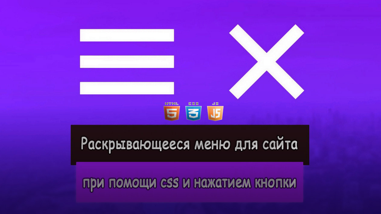 | |
| В этой статье представлено оригинальное по дизайну раскрывающееся меню, которое задействует в своем функционале стилистику CSS и также JavaScript. Отличается оно от других не своей функцией показа, так как здесь все создано по стандарту, по дизайну. Если многие привыкли наблюдать при вызове навигации плоский дизайн, то этот кардинально отличается от него. Ведь все исполнено совершенно по другому, где стили прописаны под каждый элемент или шкалу запроса. Немного CSS и Javascript дает хороший эффект скольжения с богатым современным внешним видом, в целом это сделано умно и что-то другое для вас. Чтобы попробовать как все работает, то в материале закрепим ссылку на demo страницу, что изначально можно все оценить. Одно сказать можно, что такой формат отлично смотрится под темный интернет ресурс, где можно выставить на отдельной странице или поставить на главную, что безусловно будет оригинально смотреться. Так выглядит при установочном процессе:  HTML Код <button type="button" id="hamburger"> <div class="line1 line"></div> <div class="line2 line"></div> <div class="line3 line"></div> </button> <nav id="menu"> <ul> <li><a href="/"><div>Главная</div></a></li> <li><a href="/"><div>Скрипты</div></a></li> <li><a href="/"><div>Шаблоны</div></a></li> <li><a href="/"><div>Дизайн</div></a></li> <li><a href="/"><div>Контакты</div></a></li> </ul> </nav> CSS Код #hamburger{ width: 75px; height: 48px; background: -webkit-gradient(linear, left top, left bottom, color-stop(80%, #343c4f), to(#2b4663)); background: -o-linear-gradient(top, #343c4f 80%, #2b4663); background: linear-gradient(to bottom, #343c4f 80%, #2b4663); position: fixed; outline: none; border: none; border-top: 3px solid #585472; border-bottom: 4px solid #242b3b; border-radius: 3px; cursor: pointer; -webkit-transform: skewX(-5deg); -ms-transform: skewX(-5deg); transform: skewX(-5deg); top: 7px; margin-left: calc(100% - 90px); display: inline-block; -webkit-box-shadow: 1px 2px 0 2px #000; box-shadow: 1px 2px 0 2px #000; z-index: 10; } .line{ position: relative; background: #fff; width: 50%; height: 7px; margin: auto; border: 2px solid #000; border-top: 1px solid #000; border-radius: 1px; } .line1{ -webkit-clip-path: polygon(0 0, 0 100%, 100% 90%, 100% 10%); clip-path: polygon(0 0, 0 100%, 100% 90%, 100% 10%); } .line2{ -webkit-clip-path: polygon(0 0, 0 100%, 100% 80%, 100% 20%); clip-path: polygon(0 0, 0 100%, 100% 80%, 100% 20%); } .line3{ -webkit-clip-path: polygon(0 10%, 0 85%, 100% 100%, 100% 0); clip-path: polygon(0 10%, 0 85%, 100% 100%, 100% 0); } #menu{ background: -o-radial-gradient(center right, circle, transparent 30%, #000); background: radial-gradient(circle at center right, transparent 30%, #000); display: inline-block; width: 300px; -webkit-transform: skewX(-5deg) translateX(200%); -ms-transform: skewX(-5deg) translateX(200%); transform: skewX(-5deg) translateX(200%); position: fixed; top: 0; right: -20px; opacity: 0; will-change: transform, opacity; -webkit-transition: opacity 0.1s, -webkit-transform 0.3s; transition: opacity 0.1s, -webkit-transform 0.3s; -o-transition: transform 0.3s, opacity 0.1s; transition: transform 0.3s, opacity 0.1s; transition: transform 0.3s, opacity 0.1s, -webkit-transform 0.3s; height: 100vh; max-height: 460px; min-height: 320px; overflow: auto; } .show-menu{ -webkit-transform: skewX(-5deg) translateX(0) !important; -ms-transform: skewX(-5deg) translateX(0) !important; transform: skewX(-5deg) translateX(0) !important; opacity: 1 !important; } #menu ul{ margin: 0; padding: 0; } #menu li{ display: -webkit-box; display: -ms-flexbox; display: flex; width: 100%; height: 50px; -webkit-box-align: center; -ms-flex-align: center; align-items: center; -webkit-box-pack: center; -ms-flex-pack: center; justify-content: center; margin: 15px 0; -webkit-transform: translateX(200%); -ms-transform: translateX(200%); transform: translateX(200%); will-change: transform; -webkit-transition: -webkit-transform 0.3s; transition: -webkit-transform 0.3s; -o-transition: transform 0.3s; transition: transform 0.3s; transition: transform 0.3s, -webkit-transform 0.3s; } .show-li { -webkit-transform: translateX(0) !important; -ms-transform: translateX(0) !important; transform: translateX(0) !important; } .show-li:nth-child(1) { -webkit-transition-delay: 0.1s !important; -o-transition-delay: 0.1s !important; transition-delay: 0.1s !important; } .show-li:nth-child(2) { -webkit-transition-delay: 0.2s !important; -o-transition-delay: 0.2s !important; transition-delay: 0.2s !important; } .show-li:nth-child(3) { -webkit-transition-delay: 0.3s !important; -o-transition-delay: 0.3s !important; transition-delay: 0.3s !important; } .show-li:nth-child(4) { -webkit-transition-delay: 0.4s !important; -o-transition-delay: 0.4s !important; transition-delay: 0.4s !important; } .show-li:nth-child(5) { -webkit-transition-delay: 0.5s !important; -o-transition-delay: 0.5s !important; transition-delay: 0.5s !important; } #menu li:first-of-type{ margin-top: 100px; } #menu li:last-of-type{ margin-bottom: 50px; } #menu li a{ display: block; text-align: center; text-decoration: none; width: 70%; height: 48px; background: -webkit-gradient(linear, left top, left bottom, color-stop(80%, #343c4f), to(#2b4663)); background: -o-linear-gradient(top, #343c4f 80%, #2b4663); background: linear-gradient(to bottom, #343c4f 80%, #2b4663); outline: none; border: none; border-top: 3px solid #585472; border-bottom: 4px solid #242b3b; border-radius: 3px; cursor: pointer; -webkit-box-shadow: 1px 2px 0 2px #000; box-shadow: 1px 2px 0 2px #000; z-index: 10; color: #fff; display: -webkit-box; display: -ms-flexbox; display: flex; -webkit-box-align: center; -ms-flex-align: center; align-items: center; -webkit-box-pack: center; -ms-flex-pack: center; justify-content: center; font-weight: 900; font-size: 16px; text-shadow: 1px 1px #000, -1px -1px #000, -1px 1px #000, 1px -1px #000, 0 1px #000, 0 -1px #000, 1px 0 #000, -1px 0 #000; } #menu li a div{ display: inline-block; } #menu::-webkit-scrollbar{ width: 0; height: 0; } @media screen and (max-width: 880px) { #hamburger{ bottom: 10px; top: auto; left: 50%; -webkit-transform: translateX(-50%) skewX(0deg); -ms-transform: translateX(-50%) skewX(0deg); transform: translateX(-50%) skewX(0deg); margin: auto; } #menu{ background-image: -o-radial-gradient(center bottom, circle, transparent 5%, #000); background-image: radial-gradient(circle at center bottom, transparent 5%, #000); -webkit-transform: skewX(0deg) translate(-50%, 200%); -ms-transform: skewX(0deg) translate(-50%, 200%); transform: skewX(0deg) translate(-50%, 200%); top: auto; bottom: 0; left: 50%; } .show-menu{ -webkit-transform: skewX(0deg) translate(-50%, 0) !important; -ms-transform: skewX(0deg) translate(-50%, 0) !important; transform: skewX(0deg) translate(-50%, 0) !important; opacity: 1 !important; } #menu li:first-of-type{ margin-top: 50px; } #menu li:last-of-type{ margin-bottom: 100px; } #menu li{ -webkit-transform: translateY(2000%); -ms-transform: translateY(2000%); transform: translateY(2000%); } .show-li { -webkit-transform: translateY(0) !important; -ms-transform: translateY(0) !important; transform: translateY(0) !important; } } JS Код const menuItems = menu.getElementsByTagName('li'); hamburger.onclick = () => { menu.classList.toggle('show-menu'); for(let menuItem of menuItems) menuItem.classList.toggle('show-li'); } for(let menuItem of menuItems) menuItem.onclick = () => { menu.classList.toggle('show-menu'); for(let menuItem of menuItems) menuItem.classList.toggle('show-li'); } В этом руководстве описан процесс создания и установки по являющего по клику меню с использованием HTML, CSS. Где вы можете задать тему, что будет на одной страницы, и выставит ссылке под переход, что не исключаю увидеть якоря на данные запросы. Демонстрация | |
11 Июня 2020 Загрузок: 1 Просмотров: 1514
Поделиться в социальных сетях
Материал разместил