5 вариантов кнопок с помощью HTML и CSS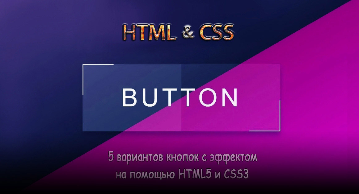 | |
| Кнопки на CSS3 для сайта, это один из важных элементов дизайна, плюс функций, так как они идут для перехода и украшают своим оформлением сайты. И в этом материале представлен небольшой набор из пяти кнопок, которые идут под оригинальную анимацию, что производится при наведении курсора. Где, как правило, нам просто нужно несколько строк кода для создания кнопки в HTML, но главное прописать красивое оформление, где присутствует эффекты. В этой статье мы будем практиковать написание HTML и CSS для создания динамической кнопки с оригинальными трюками. Сама концепция довольно проста, но именно с этой небольшой подборкой кнопок будет продемонстрирована основные концепции в создание и стилизацию кнопок с помощью HTML и CSS, где не будет JavaScript, все только на чистой стилистике, что поможет вам визуализировать все трюки, которые можно задействовать по разному функционалу. И так начнем, все по вариантам и демонстрация для просмотра: 1. Вариант:  HTML CSS Код body { height: 100vh; overflow: hidden; display: flex; align-items: center; justify-content: center; flex-direction: column; background-color: #ffffff; background-image: linear-gradient(315deg, #ffffff 0%, #d7e1ec 74%); } .dusonebu { -webkit-touch-callout: none; -webkit-user-select: none; -khtml-user-select: none; -moz-user-select: none; -ms-user-select: none; user-select: none; -webkit-tap-highlight-color: transparent; } button { width: 150px; height: 50px; cursor: pointer; margin: 5px; background: none; border: none; display: flex; align-items: center; justify-content: center; } .customed { background-color: #63a4ff; background-image: linear-gradient(315deg, #63a4ff 0%, #83eaf1 74%); border-radius: 10px; color: white; } .customed svg { position: absolute; margin-left: 90px; fill: transparent; transition: 500ms; } .customed span { transition: 500ms; } .customed:hover span{ margin-right: 30px; } .customed:hover svg { margin-left: 40px; fill: white; } .agvanudus { height: 30px; } .agvanudus svg { width: 15px; height: 15px; margin-right: 5px; fill: transparent; stroke: black; stroke-width: 2px; } .agvanudus:hover svg{ fill: red; stroke: transparent; } button:focus { outline: none; } Изначально кнопка создана под интернет магазин, где при наведении выезжает корзина. Демонстрация 2. Вариант:  HTML Код <div class="amounysan customan"><span>ZorNet.Ru</span></div> CSS Код body { height: 100vh; overflow: hidden; display: flex; align-items: center; justify-content: center; background: #5e4e91; } .customan { -webkit-touch-callout: none; -webkit-user-select: none; -khtml-user-select: none; -moz-user-select: none; -ms-user-select: none; user-select: none; -webkit-tap-highlight-color: transparent; } .amounysan { width: 150px; height: 50px; cursor: pointer; border: none; display: flex; align-items: center; justify-content: center; background-color: #08e1ae; background-image: linear-gradient(315deg, #08e1ae 0%, #98de5b 74%); } .amounysan::before, .amounysan::after { width: 150px; height: 10px; position: absolute; background: #5e4e91; content: ''; border-radius: 50%; transition: 300ms; } .amounysan::before { transform: translateY(-30px); } .amounysan::after { transform: translateY(30px); } .amounysan:hover::before { transform: translateY(-25px); } .amounysan:hover::after { transform: translateY(25px); } .amounysan span { display: flex; align-items: center; justify-content: center; font-size: 25px; font-family: 'Pacifico', cursive; color: white; transform: translateY(-5px); transition: 500ms; } .amounysan span::before, .amounysan span::after { width: 10px; height: 50px; position: absolute; tranform: translateY(5px); background: #5e4e91; content: ''; border-radius: 50%; transition: 300ms; } .amounysan span::before { transform: translate(-80px, 5px) } .amounysan span::after { transform: translate(80px, 5px) } .amounysan:hover span::before { transform: translate(-75px, 5px); } .amounysan:hover span::after { transform: translate(75px, 5px); } Эффект заключается в том, что при наведении сжимаются все стороны. Демонстрация 3. Вариант:  HTML Код <button class="name noselect flex-center"></button> CSS Код * { margin: 0; padding: 0; box-sizing: border-box; } .flex-center { display: flex; align-items: center; justify-content: center; } body { height: 100vh; overflow: hidden; display: flex; align-items: center; justify-content: center; background-color: #000000; background-image: linear-gradient(147deg, #000000 0%, #434343 74%); } .noselect { -webkit-touch-callout: none; -webkit-user-select: none; -khtml-user-select: none; -moz-user-select: none; -ms-user-select: none; user-select: none; -webkit-tap-highlight-color: transparent; } button { width: 150px; height: 50px; cursor: pointer; border: none; border-radius: 25px; background-color: #50d8d7; background-image: linear-gradient(316deg, #50d8d7 0%, #923993 74%); transition: 500ms; } button::after { width: 143px; height: 43px; position: absolute; display: flex; align-items: center; justify-content: center; content: 'ZorNet.Ru'; font-size: 20px; color: #eee; border-radius: 25px; background-color: #222; transition: 500ms; } button:hover::after { font-size: 25px; background-color: transparent; } button:hover { transform: scale(0.9); } button:focus { outline: none; } В этом трюке присутствует градиент, где изначально видим одну форму, но потом при клике она меняется. Демонстрация 4. Вариант:  HTML Код <div class="sovauna contractua">ZorNet.Ru</div> CSS Код body { display: flex; align-items: center; justify-content: center; height: 100vh; overflow: hidden; background-color: #c177b2; background-image: linear-gradient(315deg, #c177b2 0%, #e2e1e1 74%); } .contractua { -webkit-touch-callout: none; -webkit-user-select: none; -khtml-user-select: none; -moz-user-select: none; -ms-user-select: none; user-select: none; -webkit-tap-highlight-color: transparent; } .sovauna { width: 150px; height: 50px; cursor: pointer; font-family: 'Dancing Script', cursive; color: #fff; font-size: 30px; background-color: #d387ab; background-image: linear-gradient(315deg, #d387ab 0%, #b279a7 74%); border-radius: 10px; display: flex; align-items: center; justify-content: center; transition: 700ms ease; } .sovauna::before { content: ''; width: 150px; height: 50px; position: absolute; border-radius: 8px; border: 2px solid #fff; height: 40px; width: 140px; transition: 500ms ease; } .sovauna:hover { font-size: 27px; filter: brightness(110%); } .sovauna:hover::before { width: 150px; height: 50px; border: 2px solid rgba(255,255,255,0); } Интересный трюк, что срабатывает, как только клик наводим на дизайн. Демонстрация 5. Вариант:  HTML Код <button class="sunrise medeodus"><div class="anagem"></div></button> CSS Код body { height: 100vh; overflow: hidden; display: flex; align-items: center; justify-content: center; background-color: #f3f4f7; background-image: linear-gradient(315deg, #f3f4f7 0%, #caccd1 74%); } .medeodus { -webkit-touch-callout: none; -webkit-user-select: none; -khtml-user-select: none; -moz-user-select: none; -ms-user-select: none; user-select: none; -webkit-tap-highlight-color: transparent; } button { width: 150px; height: 50px; font-family: 'Sacramento', cursive; font-size: 30px; cursor: pointer; background: transparent; border: none; border-radius: 10px; overflow: hidden; } button .anagem { width: 150px; height: 500px; color: white; background: rgb(2,0,36); background: linear-gradient(180deg, rgba(2,0,36,1) 0%, rgba(152,0,36,1) 24%, rgba(195,95,0,1) 42%, rgba(255,210,2,1) 66%, rgba(0,185,255,1) 89%); display: flex; justify-content: center; transition: 3s; } .anagem::before { content: '☀️'; font-size: 35px; position: absolute; transform: translate(64px, 435px); text-shadow: -5px 5px 30px white; opacity: 0; transition: 1s; } .anagem::after { content: "ZorNet.Ru"; margin-top: 8px; transition: 3s; } button:hover .anagem { transform: translateY(-450px); } button:hover .anagem::after { transform: translateY(450px); } button:hover .anagem::before { opacity: 1; } Здесь анимация заключается в смене оттенков и появление значка. Демонстрация В материале узнали, как создать кнопку с помощью HTML, а также стилизовать кнопку с помощью CSS. Помните, что вы можете писать документы HTML, CSS и в одном и том же стиле, где самостоятельно поменять оттенок или увеличить сам эффект. То иногда бывает такое, что сама кнопка очень понравилась по своей форме и закрепленном эффекта, а вот цветовая гамма не подходит. А здесь будет несложно все отредактировать под ту палитру цвета, которая вам нужно, чтоб стильно смотрелось на сайте. | |
07 Июня 2020 Загрузок: 4 Просмотров: 1749
Поделиться в социальных сетях
Материал разместил