Красивый эффект чашки кафе на CSS3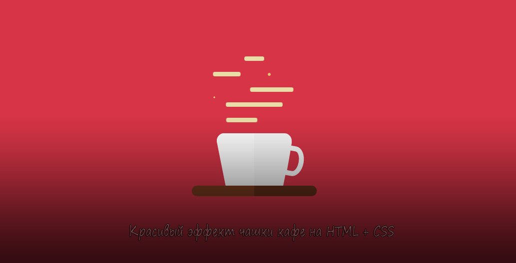 | |
| Отличное решение в создание чашки кафе с красивыми и оригинальными эффектами, где стилистика дизайна выполнена при помощи всего лишь HTML и CSS. Сама суть дизайна состоит в том, что здесь при помощи кода в HTML, который составляет каркас, и безусловно стилей CSS. Где выстраиваем корректный анимационный рисунок, что выставлено как чашка с горячим кофе или чая, так как здесь присутствует эффект пара. Теперь на не нужно картинки с анимацией ставить, когда можно выстроить с помощью стилей, это поменять оттенок цвета и все оттенки, что присутствуют на элементе. Можно задействовать в тематическом направление, ведь много сайтов представляют различные кофейни. Где выбираем место на ресурсе, где остается поставить значение высоты или ширины, так, что корректно все выглядело, но и вписалось в основу ресурса. Установка: HTML Код <div class="cusped_casken"> <div class="cisterncusped_casken"> <div class="cistern1"></div> <div class="cisterns"> <div class="cistern2"></div> <div class="chashka2"></div> </div> <div class="cisterns"> <div class="cistern3"></div> <div class="chashka3"></div> </div> <div class="cistern4"></div> <div class="cisterns"> <div class="cistern5"></div> <div class="chashka5"></div> </div> </div> <div class="vesenles"></div> <div class="aerosolka"></div> <div class="handle"></div> <div class="podstavka"></div> </div> CSS Код .cusped_casken { margin: auto; width: 250px; height: 350px; display: flex; flex-direction: column; justify-content: flex-end; align-items: center; position: relative; } .podstavka { width: 100%; height: 6%; background-color: #7c3c21; border-radius: 10px; position: relative; } .podstavka::after { content: ""; width: 50%; height: 100%; background-color: #63301a; position: absolute; right: 0; border-radius: 0 10px 10px 0; } .aerosolka { height: 30%; width: 30%; background-color: white; position: absolute; bottom: 21px; left: 50px; border-radius: 15px 0 0 0; } .aerosolka::after { content: ""; width: 0; height: 0; border-bottom: 100px solid #d63447; border-right: 20px solid transparent; } .vesenles { width: 60%; height: 30%; background-color: #f9f9f9; border-radius: 15px 15px 0 0; position: relative; } .vesenles::before { content: ""; width: 0; height: 0; border-bottom: 100px solid #d63447; border-left: 20px solid transparent; position: absolute; right: -3px; bottom: 0; } .handle { height: 60px; width: 40px; border-radius: 0 50% 50% 0; background-color: #d63447; border: 10px solid #f9f9f9; position: absolute; right: 26px; bottom: 40px; transform: rotate(10deg); } .cisterncusped_casken { width: 80%; height: 50%; display: flex; flex-direction: column; justify-content: space-evenly; } .cistern1, .cistern2, .cistern3, .cistern4, .cistern5 { width: 20%; height: 5%; background-color: #eadca6; border-radius: 10px; animation: cisternFloating 1.5s infinite linear; } .cistern1 { align-self: center; animation-delay: 1.3s; } .cistern2 { width: 30%; height: 100%; animation-delay: 1s; position: relative; right: 50px; } .cistern3 { width: 50%; height: 100%; animation-delay: 0.8s; position: relative; left: 40px; } .cistern4 { width: 70%; align-self: center; animation-delay: 0.5s; } .cistern5 { width: 35%; height: 100%; animation-delay: 0.2s; position: relative; right: 20px; } .cisterns { width: 200px; height: 5%; display: flex; justify-content: center; } .chashka2, .chashka3, .chashka5 { width: 10px; height: 10px; border-radius: 50%; background-color: #e2c275; animation: chashkaFloating 1.5s infinite ease-in; position: relative; } .chashka3 { top: 15px; right: 130px; animation-delay: 0.7s; } .chashka5 { top: 5px; animation-delay: 0.4s; } @keyframes cisternFloating { 0% { transform: scaleX(1); } 50% { transform: scaleX(0.8); } 100% { transform: scaleX(1); } } @keyframes chashkaFloating { 0% { transform: scale(1) } 50% { transform: scale(0); } 100% { transform: scale(1); } } По сути здесь представлен один элемент, что больше идет под плоский стиль, но с возможностью теней можно этот предмет обозначить гораздо интереснее, но здесь больше зависит, где и в каком месте производится установочный процесс. Демонстрация | |
13 Января 2021 Загрузок: 3 Просмотров: 1039
Поделиться в социальных сетях
Материал разместил