Неоновая CSS анимация кнопок для сайта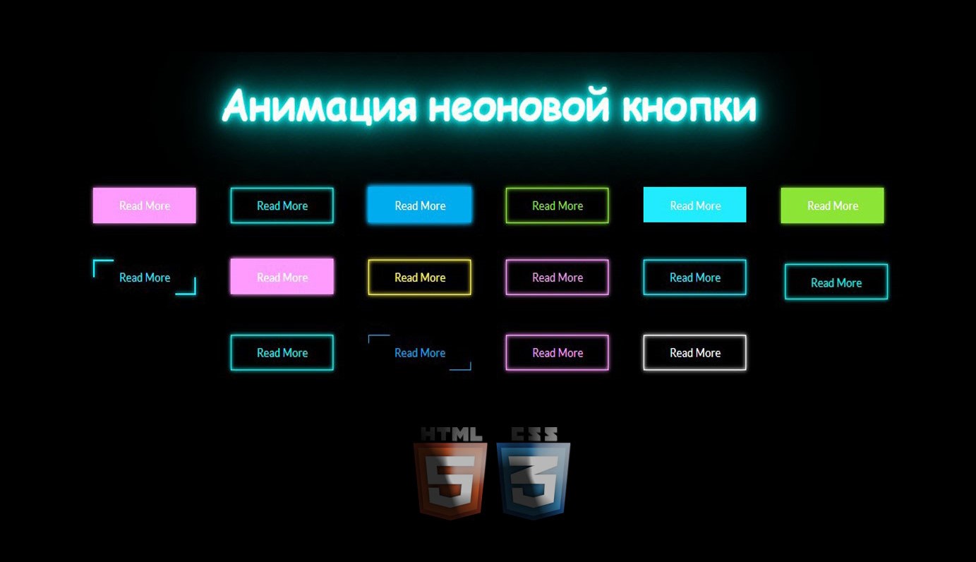 | |
| Это просто потрясающая анимация для неоновых кнопок, которые отлично подойдут на темный формат сайта, где каждая кнопка выполнена оригинальна. Кто то спрашивает, а как можно добавить интерес к своему сайту, но это видно, что визуальный интерес к вашему веб-сайту может также появится с помощью привлекательной кнопки. Так как неоновая кнопка — это по своему уникальный элемент кнопки, который оригинально смотрится на веб-странице или интернет ресурсе, который по умолчанию имеет светящийся или неоновый вид, а также элементы анимации при наведение курсора. Не секрет, что их основном можно увидеть при использование HTML и CSS, где некоторые подключают шрифтовые знаки, но по мне они здесь как раз лишнее станут. Здесь задействуем свойства box-shadow, а также text-shadow - это все нужно для создания эффекта свечения. За частую такой стиль кнопок используют, чтоб как можно больше привлечь внимание, что с данной работой они прекрасно справляются. Неоновые кнопки в большинстве из них можно также задействовать для придания дизайну визуально яркий или футуристический оттенок. Это в частности используют в сочетании с другими неоновыми или футуристическими элементами дизайна, где только разная палитра цветов, такими как неоновый текст или неоновый фон. Но и не нужно ими сильно нагружать сайт, ведь многих они просто могут отпугивать, если вы везде распишите нейлон, он должен быть в меру, чтоб все красиво и оригинально смотрелось. Как создать потрясающую неоновую кнопку с CSSЗдесь представлены все кнопки при открытие страницы:  Установка: HTML Код <div class="osnovanua"> <button class="knopka_neion lusa-1">Название</button> <button class="knopka_neion lusa-2">Название</button> <button class="knopka_neion lusa-3">Название</button> <button class="knopka_neion lusa-4">Название</button> <button class="knopka_neion lusa-5"><span>Название</span></button> <button class="knopka_neion lusa-6"><span>Название</span></button> <button class="knopka_neion lusa-7"><span>Название</span></button> <button class="knopka_neion lusa-8">Название</button> <button class="knopka_neion lusa-9">Название</button> <button class="knopka_neion lusa-10">Название</button> <button class="knopka_neion lusa-11">Название</button> <button class="knopka_neion lusa-12"><span>Click!</span><span>Название</span></button> <button class="knopka_neion lusa-13">Название</button> <button class="knopka_neion lusa-14">Название</button> <button class="knopka_neion lusa-15">Название</button> <button class="knopka_neion lusa-16"><span>Название</span></button> </div> CSS Код .osnovanua { width: 90%; margin: 40px auto; text-align: center; } button { margin: 20px; } .knopka_neion { color: #fff; width: 130px; height: 40px; padding: 10px 25px; font-family: 'Lato', sans-serif; font-weight: 500; background: transparent; cursor: pointer; transition: all 0.3s ease; position: relative; display: inline-block; } /* 1 */ .lusa-1 { border: none; background-color: #ff9aff; box-shadow: 0 0 5px #ef97e8; } .lusa-1:hover { box-shadow: 0 0 10px #ef97e8, 0 0 20px #ef97e8, 0 0 20px #fff inset; } /* 2 */ .lusa-2 { color: #0bf4f3; border: 1px solid #0bf4f3; box-shadow: 0 0 5px #0bf4f3, 0 0 5px #0bf4f3 inset; } .lusa-2:before { height: 0%; width: 2px; } .lusa-2:hover { color: #fff; box-shadow: inset 0 0 10px #0bf4f3, 0 0 20px #0bf4f3 inset, 0 0 20px #0bf4f3 inset; } /* 3 */ .lusa-3 { background: #00aced; box-shadow: 0 0 5px #00aced, 0 0 8px #00aced; line-height: 42px; padding: 0; border: none; z-index: 2; -webkit-transition: all 0.3s linear; transition: all 0.3s linear; } .lusa-3:hover{ background-color: transparent; color: #00aced; box-shadow: 0 5px 3px -3px #00aced, 0 -5px 3px -3px #00aced, 0 5px 3px -3px #00aced, 0 -5px 3px -3px #00aced; } .lusa-3:before, .lusa-3:after { position: absolute; content: ""; left: 0; width: 100%; height: 50%; right: 0; z-index: -1; background: #00aced; box-shadow: 0 0 5px #00aced; transition: all 0.3s ease; } .lusa-3:before { top: 0; } .lusa-3:after { bottom: 0; } .lusa-3:hover:before, .lusa-3:hover:after { height: 0; background-color: #00aced; } /* 4 */ .lusa-4 { color: #8ce436; padding: 0; border: 1px solid #8ce436; box-shadow: 0 0 5px #8ce436, 0 0 5px inset; } .lusa-4:after { position: absolute; content: ""; top: 5px; left: 6px; width: 90%; height: 70%; border: 1px solid #8ce436; box-shadow: 0 0 5px #8ce436 inset; opacity: 0; transition: all 0.3s ease; } .lusa-4:hover:after { opacity: 1; } /* 5 */ .lusa-5 { background: #21ebff; line-height: 42px; padding: 0; border: none; } .lusa-5:hover{ background: transparent; color: #21ebff; } .lusa-5:before, .lusa-5:after{ content:''; position:absolute; top:0; right:0; height:2px; background: #21ebff; width:0; box-shadow: 0 0 5px #21ebff, 0 0 5px #21ebff inset; transition:400ms ease all; } .lusa-5:after{ right:inherit; top:inherit; left:0; bottom:0; } .lusa-5:hover:before, .lusa-5:hover:after{ width:100%; transition:800ms ease all; } /* 6 */ .lusa-6 { background: #8ce436; line-height: 40px; padding: 0; border: none; box-shadow: 0 0 5px #8ce436; } .lusa-6 span { position: relative; display: block; width: 100%; height: 100%; } .lusa-6:hover{ background: transparent; } .lusa-6:before, .lusa-6:after { position: absolute; content: ""; height: 0%; width: 2px; background: #8ce436; box-shadow: 0 0 5px #8ce436; } .lusa-6:before { right: 0; top: 0; transition: all 500ms ease; } .lusa-6:after { left: 0; bottom: 0; transition: all 500ms ease; } .lusa-6:hover:before { transition: all 500ms ease; height: 100%; } .lusa-6:hover:after { transition: all 500ms ease; height: 100%; } .lusa-6 span:before, .lusa-6 span:after { position: absolute; content: ""; background: #8ce436; box-shadow: 0 0 5px #8ce436; } .lusa-6 span:before { left: 0; top: 0; width: 0%; height: 2px; transition: all 500ms ease; } .lusa-6 span:after { right: 0; bottom: 0; width: 0%; height: 2px; transition: all 500ms ease; } .lusa-6 span:hover:before { width: 100%; } .lusa-6 span:hover:after { width: 100%; } /* 7 */ .lusa-7 { color: #21ebff; line-height: 40px; padding: 0; border: none; } .lusa-7 span { position: relative; display: block; width: 100%; height: 100%; } .lusa-7:before, .lusa-7:after { position: absolute; content: ""; right: 0; bottom: 0; background: #21ebff; box-shadow: 0 0 5px #21ebff; transition: all 0.3s ease; } .lusa-7:before{ height: 50%; width: 2px; } .lusa-7:after { width: 20%; height: 2px; } .lusa-7:hover:before { height: 100%; } .lusa-7:hover:after { width: 100%; } .lusa-7 span:before, .lusa-7 span:after { position: absolute; content: ""; left: 0; top: 0; background: #21ebff; box-shadow: 0 0 5px #21ebff; transition: all 0.3s ease; } .lusa-7 span:before { width: 2px; height: 50%; } .lusa-7 span:after { height: 2px; width: 20%; } .lusa-7 span:hover:before { height: 100%; } .lusa-7 span:hover:after { width: 100%; } /* 8 */ .lusa-8 { line-height: 40px; padding: 0; background: transparent; border: 1px solid #ff9aff; box-shadow: 0 0 5px #ff9aff, 0 0 5px #ff9aff inset; position: relative; z-index: 2; color: #fff; -webkit-perspective: 300px; perspective: 300px; -webkit-transform-style: preserve-3d; transform-style: preserve-3d; } .lusa-8:hover{ color: #ff9aff; } .lusa-8:after { position: absolute; content: ""; top: 0; left: 0; width: 100%; height: 100%; background: #ff9aff; box-shadow: 0 0 5px #ff9aff; z-index: -1; -webkit-transform-origin: center bottom; transform-origin: center bottom; -webkit-transform: rotateX(0); transform: rotateX(0); transition: all 0.3s ease; } .lusa-8:hover:after { -webkit-transform: rotateX(-180deg); transform: rotateX(-180deg); } /* 9 */ .lusa-9 { color: #fff352; border: 1px solid #fff352; box-shadow: 0 0 5px #fff352, 0 0 5px #fff352 inset; z-index: 2; transition: all 0.3s ease; overflow: hidden; } .lusa-9:after { position: absolute; content: " "; z-index: -1; top: 0; left: 0; width: 100%; height: 100%; transition: all 0.3s ease; } .lusa-9:hover { color: #000; } .lusa-9:hover:after { background: #fff352; -webkit-transform: scale(2) rotate(180deg); transform: scale(2) rotate(180deg); box-shadow: 4px 4px 6px 0 rgba(255,255,255, 1), -4px -4px 6px 0 rgba(116, 125, 136, .2), inset -4px -4px 6px 0 rgba(255,255,255, 1), inset 4px 4px 6px 0 rgba(116, 125, 136, .3); } /* 10 */ .lusa-10 { border: 1px solid #ff9aff; box-shadow: 0 0 5px #ff9aff, 0 0 5px #ff9aff inset; color: #ff9aff; background: #000; z-index: 2; transition: all 0.3s ease; overflow: hidden; } .lusa-10:after { position: absolute; content: " "; top: 0; left: 0; z-index: -1; width: 100%; height: 100%; background: #ff9aff; transition: all 0.3s ease; -webkit-transform: scale(0); transform: scale(0); } .lusa-10:hover { color: #fff; } .lusa-10:hover:after { -webkit-transform: scale(1); transform: scale(1); } /* 11 */ .lusa-11 { border: 1px solid #21ebff; color: #21ebff; box-shadow: 0 0 5px #21ebff, 0 0 5px #21ebff inset; transition: all 0.3s ease; } .lusa-11:hover{ text-shadow: 0 0 20px #21ebff, 0 0 50px rgba(33, 235, 255, .9), 0 0 75px rgba(33, 235, 255, .8), 0 0 76px rgba(33, 235, 255, .7), 0 0 77px rgba(33, 235, 255, .6), 0 0 78px rgba(33, 235, 255, .5), 0 0 79px rgba(33, 235, 255, .4), 0 0 80px rgba(33, 235, 255, .3), 0 0 85px rgba(33, 235, 255, .2), 0 0 99px rgba(33, 235, 255, .1); } /* 12 */ .lusa-12{ color: #0bf4f3; position: relative; right: 20px; bottom: 20px; border:none; width: 130px; height: 40px; line-height: 40px; -webkit-perspective: 230px; perspective: 230px; } .lusa-12 span { display: block; position: absolute; width: 130px; height: 40px; border: 1px solid #0bf4f3; box-shadow: 0 0 5px #0bf4f3, 0 0 5px #0bf4f3 inset; margin:0; text-align: center; -webkit-box-sizing: border-box; -moz-box-sizing: border-box; box-sizing: border-box; -webkit-transition: all .3s; transition: all .3s; } .lusa-12 span:nth-child(1) { box-shadow: 0 0 5px #0bf4f3, 0 0 5px #0bf4f3 inset; -webkit-transform: rotateX(90deg); -moz-transform: rotateX(90deg); transform: rotateX(90deg); -webkit-transform-origin: 50% 50% -20px; -moz-transform-origin: 50% 50% -20px; transform-origin: 50% 50% -20px; } .lusa-12 span:nth-child(2) { -webkit-transform: rotateX(0deg); -moz-transform: rotateX(0deg); transform: rotateX(0deg); -webkit-transform-origin: 50% 50% -20px; -moz-transform-origin: 50% 50% -20px; transform-origin: 50% 50% -20px; } .lusa-12:hover span:nth-child(1) { -webkit-transform: rotateX(0deg); -moz-transform: rotateX(0deg); transform: rotateX(0deg); } .lusa-12:hover span:nth-child(2) { background: #000; color: #000; box-shadow: 0 0 5px #0bf4f3, 0 0 5px #0bf4f3 inset; -webkit-transform: rotateX(-90deg); -moz-transform: rotateX(-90deg); transform: rotateX(-90deg); } /* 13 */ .lusa-13 { color: #0bf4f3; box-shadow: 0 0 5px #0bf4f3, 0 0 5px #0bf4f3 inset; border: 1px solid #0bf4f3; z-index: 1; } .lusa-13:after { position: absolute; content: ""; width: 100%; height: 0; bottom: 0; left: 0; z-index: -1; box-shadow: 0 0 5px #0bf4f3, 0 0 5px #0bf4f3 inset; transition: all 0.3s ease; } .lusa-13:hover { } .lusa-13:hover:after { top: 0; height: 100%; } .lusa-13:active { top: 2px; } /* 14 */ .lusa-14 { position: relative; color: #00aced; border: none; z-index: 2; } .lusa-14:before, .lusa-14:after { position: absolute; content: ""; width: 20%; height: 20%; border: 1px solid; z-index: -1; transition: all 0.3s ease; } .lusa-14:before{ top: 0; left: 0; border-bottom-color: transparent; border-right-color: transparent; border-top-color: #00aced; border-left-color: #00aced; } .lusa-14:after{ bottom: 0; right: 0; border-top-color: transparent; border-left-color: transparent; border-bottom-color: #00aced; border-right-color: #00aced; } .lusa-14:hover:before, .lusa-14:hover:after { border-color: #00aced; height: 100%; width: 100%; box-shadow: 0 0 5px #00aced, 0 0 5px #00aced inset; } /* 15 */ .lusa-15 { color: #ff9aff; border: 1px solid#ff9aff; box-shadow: 0 0 5px #ff9aff, 0 0 5px #ff9aff inset; z-index: 1; } .lusa-15:after { position: absolute; content: ""; width: 0; height: 100%; top: 0; right: 0; z-index: -1; background: #ff9aff; box-shadow: 0 0 20px #ff9aff; transition: all 0.3s ease; } .lusa-15:hover { color: #fff; } .lusa-15:hover:after { left: 0; width: 100%; } .lusa-15:active { top: 2px; } /* 16 */ .lusa-16 { border: 1px solid #fff; box-shadow: 0 0 5px #fff, 0 0 5px #fff inset; } .lusa-16:after { position: absolute; content: ""; width: 0; height: 100%; top: 0; left: 0; direction: rtl; z-index: -1; box-shadow: -7px -7px 20px 0px #fff9, -4px -4px 5px 0px #fff9, 7px 7px 20px 0px #0002, 4px 4px 5px 0px #0001; transition: all 0.3s ease; } .lusa-16:hover { box-shadow: rgba(255,255,255, 1) -1px -1px, -2px -2px, rgba(255,255,255, 1) -3px -3px, rgba(255,255,255, .9) -4px -4px, rgba(255,255,255,.8) -5px -5px, rgba(255,255,255,.7) -6px -6px, rgba(255,255,255,.6) -7px -7px, rgba(255,255,255,.5) -8px -8px, rgba(255,255,255,.4) -9px -9px, rgba(255,255,255,.3) -10px -10px, rgba(255,255,255,.2) -11px -11px, rgba(255,255,255,.1) -12px -12px; } .lusa-16:hover:after { left: auto; right: 0; width: 100%; } .lusa-16:active { top: 2px; } В этом материале мы рассмотрели подборку нейлоновых кнопок, где каждый элемент идет как оригинальный стиль дизайна, что за собой еще несет анимационный характер движения с наведением клика на основание кнопки. Теперь вы знаете, что необходимые для создания анимированной неоновой кнопки для вашего веб-сайта с помощью чистого CSS, где вы даже можете самостоятельно сменить на свой оттенок, который ближе к стилистике сайта. Демонстрация | |
23 Октября 2023 Загрузок: 1 Просмотров: 1313
Поделиться в социальных сетях
Материал разместил