Эффектная анимация 404 страницы для сайта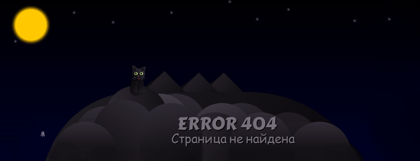 | |
| В темном дизайне создана концепция для страницы под номером 404, где присутствует анимация CSS, также сам рисунок на разную тематику сайта. Как известно, что такой формат страницы должен на каждом сайте, так как иногда веб разработчики убирают старый или не нужный материал, и такой страницы не существует. Но в поисковой системе какое-то время остается на ее запрос, где гости или пользователи ресурса могут перейти. Где сразу автоматически попадают на эту страницу, но в том случай если вы ее установите. На ней сразу видно в верхнем левом углу в желтом оттенке луну, что такая гамма отлично сочетается. Потом идут горы или пригорок, где на сомом верху сидит код и моргает, а позади его падают и мигают звезды. Но и безусловно сама запись что вы попали не туда или можно самостоятельно написать, что такого материала не существует, и выставить один или несколько запросов, чтоб можно было выйти по одному клику на сайт. Это на главную страницу или на разделы с категориями, вообще ключевые слова, чтоб заинтересовали на переход, этим вы не потеряете потенциального пользователя.  Приступаем к установке: HTML Код <div class="peopluencing"> <div class="desmicensem"><div></div><div></div><div></div><div></div><div></div><div></div><div></div><div></div><div></div><div></div><div></div><div></div><div></div><div></div><div></div><div></div></div> <div class="hill"></div> <span class="celebksag-kiesincludes">Page - Not Found</span> <span class="nologicalad-sancemen">ERROR 404</span> <div class="becomin-gemone"></div> <div class="mselvesucemen">☄</div> <div class="nesdenugeka"> <div></div> <div></div> <div></div> </div> <div class="pectson-question"> <div></div> <div></div> <div></div> <div></div> <div></div> <div></div> <div></div> <div></div> </div> <div class="my-marking"> <div class="ear-l"> <div class="ear-fur-l"></div> </div> <div class="ear-r"> <div class="ear-fur-r"></div> </div> <div class="head-marking"> <div class="dusinge-nuence"></div> <div class="dusinge-nuence-1"></div> <div class="dusinge-nuence-2"></div> <div class="eye-l"> <div class="eye-lz"></div> </div> <div class="marking-nose"></div> <div class="eye-r"> <div class="eye-rz"></div> </div> <div class="muzzle-marking"></div> <div class=" jaws-marking"></div> <div class="whiskers"> <div></div> <div></div> <div></div> <div></div> <div></div> <div></div> </div> </div> <div class="body-marking"></div> <div class="body-marking-1"></div> <div class="paw-marking-l"><div></div></div> <div class="paw-marking-r"><div></div></div> <div class="tail-marking"></div> </div> <div class="prosablas"> <div class="prosablas-mountain_1"></div> <div class="prosablas-mountain_s_1"></div> <div class="prosablas-mountain_2"></div> <div class="prosablas-mountain_s_2"></div> <div class="prosablas-mountain_3"></div> <div class="prosablas-mountain_s_3"></div> </div> </div> </div> CSS Код body{ background:#000} .peopluencing{ overflow:hidden; left:-10px; position:absolute; width:100%; height:100%; background:linear-gradient(#000,#002)} .prosablas-mountain_1,.prosablas-mountain_s_1,.prosablas-mountain_2,.prosablas-mountain_s_2,.prosablas-mountain_3,.prosablas-mountain_s_3{ width:140px; height:140px; background:linear-gradient(90deg,#222,#000); transform:rotate(45deg); position:absolute; } .prosablas{ position:absolute; bottom:3%; left:40%} .prosablas-mountain_1{ z-index:8; left:140px; bottom:25px; width:180px; height:180px; } .prosablas-mountain_s_1{ z-index:7; transform:rotate(52deg); left:125px; bottom:25px; width:180px; height:180px; background:#111} .prosablas-mountain_2{ z-index:11; left:-50px; bottom:30px; width:180px; height:180px; } .prosablas-mountain_s_2{ z-index:10; transform:rotate(52deg); left:-65px; bottom:30px; width:180px; height:180px; background:#111} .prosablas-mountain_3{ z-index:10; left:60px; bottom:25px; width:180px; height:180px; } .prosablas-mountain_s_3{ z-index:9; transform:rotate(52deg); left:45px; bottom:25px; width:180px; height:180px; background:#111} .desmicensem div{ left:20%; z-index:15; position:absolute; bottom:0; border-radius:100px 100px 0 0; background:linear-gradient(#333,#111); width:200px; height:150px} .desmicensem div:nth-child(2){ z-index: 15; left: 48%; bottom: 0px; height: 130px; background:linear-gradient(120deg, #333, #111)} .desmicensem div:nth-child(3){ z-index:14; background:linear-gradient(#222,#111); left:40%; bottom:0px; height:180px; width:150px} .desmicensem div:nth-child(4){ z-index:14; background:linear-gradient(190deg,#333,#111); left:38%; bottom:20px; height:170px} .desmicensem div:nth-child(5){ z-index:15; left:25%; bottom:0px; height:170px; background:linear-gradient(210deg,#333,#111)} .desmicensem div:nth-child(6){ background:linear-gradient(180deg,#444,#111); z-index:14; left:34%; bottom:0px; height:190px} .desmicensem div:nth-child(7){ background:linear-gradient(170deg,#333,#111); z-index:13; left:55%; bottom:0; height:140px} .desmicensem div:nth-child(8){ background:linear-gradient(160deg,#444,#111); z-index:14; left:50%; bottom:0; height:160px} .desmicensem div:nth-child(9){ background:linear-gradient(170deg,#333,#111); z-index:15; left:37%; bottom:0px; height:160px} .desmicensem div:nth-child(10){ background:linear-gradient(-210deg,#333,#111); z-index:13; left:55%; bottom:0px; height:160px} .desmicensem div:nth-child(11){ background:linear-gradient(-180deg,#222,#111); z-index:13; left:67%; bottom:0px; height:130px} .desmicensem div:nth-child(12){ background:linear-gradient(-180deg,#222,#111); z-index:15; left:70%; bottom:0px; height:100px} .desmicensem div:nth-child(13){ background:linear-gradient(180deg,#333,#111); z-index:110; left:15%; bottom:0px; height:100px} .desmicensem div:nth-child(14){ background:linear-gradient(180deg,#333,#111); z-index:110; left:75%; bottom:0px; height:100px} .desmicensem div:nth-child(15){ background:linear-gradient(180deg,#333,#111); z-index:110; left:60%; bottom:0px; height:130px} .desmicensem div:nth-child(16){ width:85%; height:600px; border-radius:300px 400px 0 0; background:linear-gradient(130deg,#222,#000); z-index:12; left:12%; bottom:-405px} .mselvesucemen{ -webkit-animation:satellit-anima 25s linear infinite; -moz-animation:satellit-anima 25s linear infinite; animation:satellit-anima 25s linear infinite; transform:rotate(120deg); z-index:5; color:#888; peopluencingt-size:18px; position:absolute; left:10%; bottom:0} .hill{ z-index:14; background:linear-gradient(80deg,#333,#111); position:absolute; bottom:5%; left:28%; width:200px; height:190px; border-radius:100px 100px 0 0; } .becomin-gemone{ -webkit-animation:moon-anim 3s linear alternate-reverse infinite; -moz-animation:moon-anim 3s linear alternate-reverse infinite; animation:moon-anim 3s linear alternate-reverse infinite; box-shadow:0 0 15px 5px #fc0; width:100px; height:100px; border-radius:50px; background:#fc0; position:absolute; top:10%; left:5%} .pectson-question div{ -webkit-animation:star-anim 200ms linear alternate-reverse infinite; -moz-animation:star-anim 200ms linear alternate-reverse infinite; animation:star-anim 200ms linear alternate-reverse infinite; position:absolute; height:1px; width:1px; box-shadow:0 0 15px 3px #fff; background:#fff; } .pectson-question div:nth-child(1){ left:75%; top:10%} .pectson-question div:nth-child(2){ left:45%; top:12%} .pectson-question div:nth-child(3){ left:20%; top:12%} .pectson-question div:nth-child(4){ left:30%; top:18%} .pectson-question div:nth-child(5){ left:92%; top:17%} .pectson-question div:nth-child(6){ left:60%; top:5%} .pectson-question div:nth-child(7){ left:67%; top:16%} .pectson-question div:nth-child(8){ left:5%; top:30%} .nesdenugeka div{ position:absolute; top:50px; left:280px; width:400px; height:1px; transform:rotate(-45deg); background:linear-gradient(to left,transparent 0%,#fff 100%)} .nesdenugeka div:before{ content:''; position:absolute; width:4px; height:5px; background:#fff; border-radius:50%; box-shadow:0 0 14px 4px white; margin-top:-2px} .nesdenugeka div:nth-child(1){ top:45%; left:100%; -webkit-animation:meteors 3s linear infinite; -moz-animation:meteors 3s linear infinite; animation:meteors 3s linear infinite} .nesdenugeka div:nth-child(2){ top:100%; left:70%; -webkit-animation:meteors 4s linear infinite; -moz-animation:meteors 4s linear infinite; animation:meteors 4s linear infinite} .nesdenugeka div:nth-child(3){ top:70%; left:20%; -webkit-animation:meteors 2s linear infinite; -moz-animation:meteors 2s linear infinite; animation:meteors 2s linear infinite} .nologicalad-sancemen, .celebksag-kiesincludes { transform: rotate(0deg); color: #777; position: absolute; display: block; bottom: 15%; left: 46.5%; z-index: 120; text-shadow: 2px 2px 2px #000; transform: rotate(0deg); font: 55px 'Carter One', cursive; } .celebksag-kiesincludes{ bottom:3%; left:45%; peopluencingt-size:40px; } .my-marking{ z-index:100; position:absolute; left:35%; bottom:235px} .ear-l,.ear-r,.ear-fur-l,.ear-fur-r{ position:relative; z-index:2; border-radius:0 50px 0 0px; width:12px; height:14px; margin:0px 0 -16px 0px; padding:2px; transform:rotate(-2deg); background:linear-gradient(40deg,#111,#444)} .ear-r,.ear-fur-r{ border-radius:50px 0px 10px 0px; margin:0 25px -10px; transform:rotate(15deg); background:linear-gradient(-50deg,#333,#333,#111); } .ear-fur-l,.ear-fur-r{ border-radius:0 50px 0 20px; padding:0; background:linear-gradient(-30deg,#111,#222); width:10px; height:14px} .ear-fur-r{ margin:0 2px; background:linear-gradient(-290deg,#111,#222); transform:rotate(8deg); border-radius:50px 0px 20px} .head-marking{ z-index:1; position:relative; border-radius:50px; width:40px; height:35px; background:linear-gradient(40deg,#000,#444); box-shadow:0 2px 1px #111} .dusinge-nuence,.dusinge-nuence-1,.dusinge-nuence-2{ width:20px; height:2px; background:#222; position:absolute; margin:2px 10px} .dusinge-nuence-1{ margin:6px 10px; background:#222} .dusinge-nuence-2{ height:2px; margin:10px 17px; background:linear-gradient(#111,#222); width:6px} .muzzle-marking{ width:22px; height:15px; background:linear-gradient(60deg,#111, #222); border-radius:50px; top:18px; left:11px; position:absolute} .whiskers div,.whiskers div:nth-child(3){ height:1px; width:16px; background:linear-gradient(90deg,#000,#555); position:absolute; left:-7px; top:31px; transform:rotate(-15deg)} .whiskers div:nth-child(1){ top:28px; left:-5px; transform:rotate(-5deg)} .whiskers div:nth-child(2){ width:17px; top:35px; left:-5px; transform:rotate(-25deg)} .whiskers div:nth-child(3),.whiskers div:nth-child(4),.whiskers div:nth-child(5){ background:linear-gradient(90deg,#555,#000); transform:rotate(10deg); left:30px; top:31px} .whiskers div:nth-child(4){ left:29px; top:28px; transform:rotate(--2deg); width:20px; } .whiskers div:nth-child(5){ left:27px; top:34px} .jaws-marking{ -webkit-animation:jaws-marking 5s infinite; -moz-animation:jaws-marking 5s infinite; animation:jaws-marking 5s infinite; position:absolute; border-radius:30px 10px; position:absolute; border-radius:20px 20px 70px 70px; width:7px; height:3px; background:linear-gradient(#000,#d46); z-index:50; top:30px; left:17px} .eye-l,.eye-r{ -webkit-animation:sleep-marking 7s linear infinite; -moz-animation:sleep-marking 7s linear infinite; animation:sleep-marking 7s linear infinite; position:absolute; border-radius:35px 25px 30px 30px; width:10px; height:7px; background:#df9; z-index:500; top:12px; left:7px} .eye-r{ left:24px!important} .eye-lz,.eye-rz{ -webkit-animation:eye-marking 7s linear infinite; -moz-animation:eye-marking 7s linear infinite; animation:eye-marking 7s linear infinite; position:absolute; border-radius:30px 10px; transform:rotate(-45deg); width:7px; height:6px; background:#000; z-index:500; left:2px; top:0px} .eye-rz{ left:1px; } .marking-nose{ position:absolute; border-radius:20px 20px 70px 70px; width:7px; height:7px; background:linear-gradient(#000,#555); z-index:500; margin:19px 16px} .body-marking{ transform:rotate(2deg)} .body-marking,.body-marking-1{ width:30px; height:60px; border-radius:70px 0px 5px 35px; margin:-10px -7px; background:linear-gradient(120deg,#000,#111,#222); position:absolute} .body-marking-1{ border-radius:25px 80px 25px 25px; height:65px; margin:-14px 6px} .paw-marking-l,.paw-marking-r{ position:absolute; width:12px; height:46px; margin:5px 4px; background:linear-gradient(150deg,rgba(1,1,1,.4) ,rgba(34,34,34,.8)),linear-gradient(92deg,#111 3px,#222 70%,#111 ); box-shadow:-5px -2px 5px #111; border-radius:30px 0 5px 15px} .paw-marking-r{ margin:5px 22px; border-radius:0px 30px 15px 5px; background:linear-gradient(rgba(1,1,1,.4) ,rgba(34,34,34,.8)),linear-gradient(90deg,#111,#222 70%,#111); } .paw-marking-l div,.paw-marking-r div,.tail-marking{ border-radius:70px 10px 70px 10px; background:linear-gradient(#111,#222); position:absolute; width:12px; height:7px; top:38px; left:1px} .paw-marking-r div{ border-radius:10px 70px 10px 70px; } .tail-marking{ transform:rotate(-15deg); top:80px; width:40px; height:13px; border-radius:40px; background:linear-gradient(60deg,#111,#222)} @-webkit-keyframes eye-marking{ 0%{ left:3px} 10%{ border-radius:30px} 20%{ border-radius:30px; } 30%{ left:1px} 40%{ top:2px; right:2px} 50%{ left:4px} 60%{ bottom:2px} 70%{ bottom:0px; width:0} 71%{ width:5px} 80%{ left:2px} 97%{ bottom:1px; width:0} 100%{ bottom:2px} } @-moz-keyframes eye-marking{ 0%{ left:3px} 10%{ border-radius:30px} 20%{ border-radius:30px; } 30%{ left:1px} 40%{ top:2px; right:2px} 50%{ left:4px} 60%{ bottom:2px} 70%{ bottom:0px; width:0} 71%{ width:5px} 80%{ left:2px} 97%{ bottom:1px; width:0} 100%{ bottom:2px} } @keyframes eye-marking{ 0%{ left:3px} 10%{ border-radius:30px} 20%{ border-radius:30px; } 30%{ left:1px} 40%{ top:2px; right:2px} 50%{ left:4px} 60%{ bottom:2px} 70%{ bottom:0px; width:0} 71%{ width:5px} 80%{ left:2px} 97%{ bottom:1px; width:0} 100%{ bottom:2px} } @-webkit-keyframes sleep-marking{ 0%{ height:7px; top:12px; border-radius:30px} 35%{ height:8px; top:12px; border-radius:30px} 56%{ height:4px; top; 13px} 70%{ height:3px; top:15px} 71%{ height:8px; top:12px} 85%{ height:3px; top:12px} 97%{ height:0; top:15px} } @-moz-keyframes sleep-marking{ 0%{ height:7px; top:12px; border-radius:30px} 35%{ height:8px; top:12px; border-radius:30px} 56%{ height:4px; top; 13px} 70%{ height:3px; top:15px} 71%{ height:8px; top:12px} 85%{ height:3px; top:12px} 97%{ height:0; top:15px} } @keyframes sleep-marking{ 0%{ height:7px; top:12px; border-radius:30px} 35%{ height:8px; top:12px; border-radius:30px} 56%{ height:4px; top; 13px} 70%{ height:3px; top:15px} 71%{ height:8px; top:12px} 85%{ height:3px; top:12px} 97%{ height:0; top:15px} } @-webkit-keyframes jaws-marking{ 0%{ height:0} 50%{ height:3px} 100%{ height:0} } @-moz-keyframes jaws-marking{ 0%{ height:0} 50%{ height:3px} 100%{ height:0} } @keyframes jaws-marking{ 0%{ height:0} 50%{ height:3px} 100%{ height:0} } @-webkit-keyframes star-anim{ 0%{ box-shadow:0 0 10px 2px #fff; } 100%{ box-shadow:0 0 5px 1px #fff; } } @-moz-keyframes star-anim{ 0%{ box-shadow:0 0 10px 2px #fff; } 100%{ box-shadow:0 0 5px 1px #fff; } } @keyframes star-anim{ 0%{ box-shadow:0 0 10px 2px #fff; } 100%{ box-shadow:0 0 5px 1px #fff; } } @-webkit-keyframes moon-anim{ 0%{ box-shadow:0 0 20px 5px #fc0; } 100%{ box-shadow:0 0 10px 5px #fc0; } } @-moz-keyframes moon-anim{ 0%{ box-shadow:0 0 20px 5px #fc0; } 100%{ box-shadow:0 0 10px 5px #fc0; } } @keyframes moon-anim{ 0%{ box-shadow:0 0 20px 5px #fc0; } 100%{ box-shadow:0 0 10px 5px #fc0; } } @-webkit-keyframes satellit-anima{ 0%{ bottom:0; opacity:0} 2%{ opacity:1; transform:rotate(130deg)} 15%{ transform:rotate(120deg); color:#fff; text-shadow:0 0 8px} 35%{ peopluencingt-size:20px; left:15%; transform:rotate(180deg); } 55%{ peopluencingt-size:17px; transform:rotate(185deg); color:#ff8; text-shadow:0 0 8px} 57%{ peopluencingt-size:14px; } 100%{ peopluencingt-size:10px; transform:rotate(200deg); bottom:90%; left:90%; opacity:0} } @-moz-keyframes satellit-anima{ 0%{ bottom:0; opacity:0} 2%{ opacity:1; transform:rotate(130deg)} 15%{ transform:rotate(120deg); color:#fff; text-shadow:0 0 8px} 35%{ peopluencingt-size:20px; left:15%; transform:rotate(180deg); } 55%{ peopluencingt-size:17px; transform:rotate(185deg); color:#ff8; text-shadow:0 0 8px} 57%{ peopluencingt-size:14px; } 100%{ peopluencingt-size:10px; transform:rotate(200deg); bottom:90%; left:90%; opacity:0} } @keyframes satellit-anima{ 0%{ bottom:0; opacity:0} 2%{ opacity:1; transform:rotate(130deg)} 15%{ transform:rotate(120deg); color:#fff; text-shadow:0 0 8px} 35%{ peopluencingt-size:20px; left:15%; transform:rotate(180deg); } 55%{ peopluencingt-size:17px; transform:rotate(185deg); color:#ff8; text-shadow:0 0 8px} 57%{ peopluencingt-size:14px; } 100%{ peopluencingt-size:10px; transform:rotate(200deg); bottom:90%; left:90%; opacity:0} } @-webkit-keyframes meteors{ 0%{ margin:-300px -300px 0 0; opacity:1} 8%{ opacity:0} 30%{ margin-top:300px -600px 0 0; opacity:0} 100%{ opacity:0} } @-moz-keyframes meteors{ 0%{ margin:-300px -300px 0 0; opacity:1} 8%{ opacity:0} 30%{ margin-top:300px -600px 0 0; opacity:0} 100%{ opacity:0} } @keyframes meteors{ 0%{ margin:-300px -300px 0 0; opacity:1} 8%{ opacity:0} 30%{ margin-top:300px -600px 0 0; opacity:0} 100%{ opacity:0} } Она по своей концепций создана в тематическом образование, это значит можно поставить на многие темы. Но здесь лучше ставить под аналогичный стиль дизайна, хотя также много светлый интернет ресурсов, где у них установлена 404 страницу в темном стиле. Демонстрация | |
05 Ноября 2018 Просмотров: 1273
Поделиться в социальных сетях
Материал разместил