Анимация кнопок на CSS конфетного цвета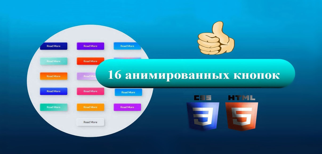 | |
| Просто шикарная подборка из 16 кнопок конфетного цвета с оригинальной анимацией на каждом элементе, где все выполнено с применением CSS стиля. Вы можете подобрать тот стиль, который будет отлично смотреться на вашем сайте. А так как каждой кнопке присвоен свой класс, то есть такое решение, чтоб сразу изначально поставить несколько элементов эффектов под разные функции. Это будет не то что смотреться просто оригинально, но сами кнопки будут дополнять основной стиль дизайна на интернет портале. Просматривая каждую анимация эффекта CSS с неординарным дизайном, где задействована цветовая палитра, или просто используется конфетные цвета, которые не похоже друг на друга в плане анимацией при наведении на них курсора. Все представлены в материале кнопки имеют эффект наведения, скажет свой уникальный, который можно редактировать в стилистике CSS, что закреплена за каждым элементом. Ведь некоторые кнопки меняют цвет при наведении, другие просто включают тени, третьи кнопки становятся бесцветными. Но одно их может соединять, это созданная рамка и заголовок кнопки. Больше понравились кнопки, которые вращаются в 3D формате. 16 кнопок с анимацией на чистом CSS Установка: HTML Код <button class="anima_krus neum-1">Сайт ZorNet</button> <button class="anima_krus neum-2">Сайт ZorNet</button> <button class="anima_krus neum-3"><span>Сайт ZorNet</span></button> <button class="anima_krus neum-4"><span>Сайт ZorNet</span></button> <button class="anima_krus neum-5"><span>Сайт ZorNet</span></button> <button class="anima_krus neum-6"><span>Сайт ZorNet</span></button> <button class="anima_krus neum-7"><span>Сайт ZorNet</span></button> <button class="anima_krus neum-8"><span>Сайт ZorNet</span></button> <button class="anima_krus neum-9">Сайт ZorNet</button> <button class="anima_krus neum-10">Сайт ZorNet</button> <button class="anima_krus neum-11">Сайт ZorNet<div class="dot"></div></button> <button class="anima_krus neum-12"><span>Click!</span><span>Сайт ZorNet</span></button> <button class="anima_krus neum-13">Сайт ZorNet</button> <button class="anima_krus neum-14">Сайт ZorNet</button> <button class="anima_krus neum-15">Сайт ZorNet</button> <button class="anima_krus neum-16">Сайт ZorNet</button> CSS Код button { margin: 20px; } .anima_krus { width: 130px; height: 40px; color: #fff; border-radius: 5px; padding: 10px 25px; font-family: 'Lato', sans-serif; font-weight: 500; background: transparent; cursor: pointer; transition: all 0.3s ease; position: relative; display: inline-block; box-shadow:inset 2px 2px 2px 0px rgba(255,255,255,.5), 7px 7px 20px 0px rgba(0,0,0,.1), 4px 4px 5px 0px rgba(0,0,0,.1); outline: none; } /* 1 */ .neum-1 { background: rgb(6,14,131); background: linear-gradient(0deg, rgba(6,14,131,1) 0%, rgba(12,25,180,1) 100%); border: none; } .neum-1:hover { background: rgb(0,3,255); background: linear-gradient(0deg, rgba(0,3,255,1) 0%, rgba(2,126,251,1) 100%); } /* 2 */ .neum-2 { background: rgb(96,9,240); background: linear-gradient(0deg, rgba(96,9,240,1) 0%, rgba(129,5,240,1) 100%); border: none; } .neum-2:before { height: 0%; width: 2px; } .neum-2:hover { box-shadow: 4px 4px 6px 0 rgba(255,255,255,.5), -4px -4px 6px 0 rgba(116, 125, 136, .5), inset -4px -4px 6px 0 rgba(255,255,255,.2), inset 4px 4px 6px 0 rgba(0, 0, 0, .4); } /* 3 */ .neum-3 { background: rgb(0,172,238); background: linear-gradient(0deg, rgba(0,172,238,1) 0%, rgba(2,126,251,1) 100%); width: 130px; height: 40px; line-height: 42px; padding: 0; border: none; } .neum-3 span { position: relative; display: block; width: 100%; height: 100%; } .neum-3:before, .neum-3:after { position: absolute; content: ""; right: 0; top: 0; background: rgba(2,126,251,1); transition: all 0.3s ease; } .neum-3:before { height: 0%; width: 2px; } .neum-3:after { width: 0%; height: 2px; } .neum-3:hover{ background: transparent; box-shadow: none; } .neum-3:hover:before { height: 100%; } .neum-3:hover:after { width: 100%; } .neum-3 span:hover{ color: rgba(2,126,251,1); } .neum-3 span:before, .neum-3 span:after { position: absolute; content: ""; left: 0; bottom: 0; background: rgba(2,126,251,1); transition: all 0.3s ease; } .neum-3 span:before { width: 2px; height: 0%; } .neum-3 span:after { width: 0%; height: 2px; } .neum-3 span:hover:before { height: 100%; } .neum-3 span:hover:after { width: 100%; } /* 4 */ .neum-4 { background-color: #4dccc6; background-image: linear-gradient(315deg, #4dccc6 0%, #96e4df 74%); line-height: 42px; padding: 0; border: none; } .neum-4:hover{ background-color: #89d8d3; background-image: linear-gradient(315deg, #89d8d3 0%, #03c8a8 74%); } .neum-4 span { position: relative; display: block; width: 100%; height: 100%; } .neum-4:before, .neum-4:after { position: absolute; content: ""; right: 0; top: 0; box-shadow: 4px 4px 6px 0 rgba(255,255,255,.9), -4px -4px 6px 0 rgba(116, 125, 136, .2), inset -4px -4px 6px 0 rgba(255,255,255,.9), inset 4px 4px 6px 0 rgba(116, 125, 136, .3); transition: all 0.3s ease; } .neum-4:before { height: 0%; width: .1px; } .neum-4:after { width: 0%; height: .1px; } .neum-4:hover:before { height: 100%; } .neum-4:hover:after { width: 100%; } .neum-4 span:before, .neum-4 span:after { position: absolute; content: ""; left: 0; bottom: 0; box-shadow: 4px 4px 6px 0 rgba(255,255,255,.9), -4px -4px 6px 0 rgba(116, 125, 136, .2), inset -4px -4px 6px 0 rgba(255,255,255,.9), inset 4px 4px 6px 0 rgba(116, 125, 136, .3); transition: all 0.3s ease; } .neum-4 span:before { width: .1px; height: 0%; } .neum-4 span:after { width: 0%; height: .1px; } .neum-4 span:hover:before { height: 100%; } .neum-4 span:hover:after { width: 100%; } /* 5 */ .neum-5 { width: 130px; height: 40px; line-height: 42px; padding: 0; border: none; background: rgb(255,27,0); background: linear-gradient(0deg, rgba(255,27,0,1) 0%, rgba(251,75,2,1) 100%); } .neum-5:hover { color: #f0094a; background: transparent; box-shadow:none; } .neum-5:before, .neum-5:after{ content:''; position:absolute; top:0; right:0; height:2px; width:0; background: #f0094a; box-shadow: -1px -1px 5px 0px #fff, 7px 7px 20px 0px #0003, 4px 4px 5px 0px #0002; transition:400ms ease all; } .neum-5:after{ right:inherit; top:inherit; left:0; bottom:0; } .neum-5:hover:before, .neum-5:hover:after{ width:100%; transition:800ms ease all; } /* 6 */ .neum-6 { background: rgb(247,150,192); background: radial-gradient(circle, rgba(247,150,192,1) 0%, rgba(118,174,241,1) 100%); line-height: 42px; padding: 0; border: none; } .neum-6 span { position: relative; display: block; width: 100%; height: 100%; } .neum-6:before, .neum-6:after { position: absolute; content: ""; height: 0%; width: 1px; box-shadow: -1px -1px 20px 0px rgba(255,255,255,1), -4px -4px 5px 0px rgba(255,255,255,1), 7px 7px 20px 0px rgba(0,0,0,.4), 4px 4px 5px 0px rgba(0,0,0,.3); } .neum-6:before { right: 0; top: 0; transition: all 500ms ease; } .neum-6:after { left: 0; bottom: 0; transition: all 500ms ease; } .neum-6:hover{ background: transparent; color: #76aef1; box-shadow: none; } .neum-6:hover:before { transition: all 500ms ease; height: 100%; } .neum-6:hover:after { transition: all 500ms ease; height: 100%; } .neum-6 span:before, .neum-6 span:after { position: absolute; content: ""; box-shadow: -1px -1px 20px 0px rgba(255,255,255,1), -4px -4px 5px 0px rgba(255,255,255,1), 7px 7px 20px 0px rgba(0,0,0,.4), 4px 4px 5px 0px rgba(0,0,0,.3); } .neum-6 span:before { left: 0; top: 0; width: 0%; height: .5px; transition: all 500ms ease; } .neum-6 span:after { right: 0; bottom: 0; width: 0%; height: .5px; transition: all 500ms ease; } .neum-6 span:hover:before { width: 100%; } .neum-6 span:hover:after { width: 100%; } /* 7 */ .neum-7 { background: linear-gradient(0deg, rgba(255,151,0,1) 0%, rgba(251,75,2,1) 100%); line-height: 42px; padding: 0; border: none; } .neum-7 span { position: relative; display: block; width: 100%; height: 100%; } .neum-7:before, .neum-7:after { position: absolute; content: ""; right: 0; bottom: 0; background: rgba(251,75,2,1); box-shadow: -7px -7px 20px 0px rgba(255,255,255,.9), -4px -4px 5px 0px rgba(255,255,255,.9), 7px 7px 20px 0px rgba(0,0,0,.2), 4px 4px 5px 0px rgba(0,0,0,.3); transition: all 0.3s ease; } .neum-7:before{ height: 0%; width: 2px; } .neum-7:after { width: 0%; height: 2px; } .neum-7:hover{ color: rgba(251,75,2,1); background: transparent; } .neum-7:hover:before { height: 100%; } .neum-7:hover:after { width: 100%; } .neum-7 span:before, .neum-7 span:after { position: absolute; content: ""; left: 0; top: 0; background: rgba(251,75,2,1); box-shadow: -7px -7px 20px 0px rgba(255,255,255,.9), -4px -4px 5px 0px rgba(255,255,255,.9), 7px 7px 20px 0px rgba(0,0,0,.2), 4px 4px 5px 0px rgba(0,0,0,.3); transition: all 0.3s ease; } .neum-7 span:before { width: 2px; height: 0%; } .neum-7 span:after { height: 2px; width: 0%; } .neum-7 span:hover:before { height: 100%; } .neum-7 span:hover:after { width: 100%; } /* 8 */ .neum-8 { background-color: #f0ecfc; background-image: linear-gradient(315deg, #f0ecfc 0%, #c797eb 74%); line-height: 42px; padding: 0; border: none; } .neum-8 span { position: relative; display: block; width: 100%; height: 100%; } .neum-8:before, .neum-8:after { position: absolute; content: ""; right: 0; bottom: 0; background: #c797eb; /*box-shadow: 4px 4px 6px 0 rgba(255,255,255,.5), -4px -4px 6px 0 rgba(116, 125, 136, .2), inset -4px -4px 6px 0 rgba(255,255,255,.5), inset 4px 4px 6px 0 rgba(116, 125, 136, .3);*/ transition: all 0.3s ease; } .neum-8:before{ height: 0%; width: 2px; } .neum-8:after { width: 0%; height: 2px; } .neum-8:hover:before { height: 100%; } .neum-8:hover:after { width: 100%; } .neum-8:hover{ background: transparent; } .neum-8 span:hover{ color: #c797eb; } .neum-8 span:before, .neum-8 span:after { position: absolute; content: ""; left: 0; top: 0; background: #c797eb; /*box-shadow: 4px 4px 6px 0 rgba(255,255,255,.5), -4px -4px 6px 0 rgba(116, 125, 136, .2), inset -4px -4px 6px 0 rgba(255,255,255,.5), inset 4px 4px 6px 0 rgba(116, 125, 136, .3);*/ transition: all 0.3s ease; } .neum-8 span:before { width: 2px; height: 0%; } .neum-8 span:after { height: 2px; width: 0%; } .neum-8 span:hover:before { height: 100%; } .neum-8 span:hover:after { width: 100%; } /* 9 */ .neum-9 { border: none; transition: all 0.3s ease; overflow: hidden; } .neum-9:after { position: absolute; content: " "; z-index: -1; top: 0; left: 0; width: 100%; height: 100%; background-color: #1fd1f9; background-image: linear-gradient(315deg, #1fd1f9 0%, #b621fe 74%); transition: all 0.3s ease; } .neum-9:hover { background: transparent; box-shadow: 4px 4px 6px 0 rgba(255,255,255,.5), -4px -4px 6px 0 rgba(116, 125, 136, .2), inset -4px -4px 6px 0 rgba(255,255,255,.5), inset 4px 4px 6px 0 rgba(116, 125, 136, .3); color: #fff; } .neum-9:hover:after { -webkit-transform: scale(2) rotate(180deg); transform: scale(2) rotate(180deg); box-shadow: 4px 4px 6px 0 rgba(255,255,255,.5), -4px -4px 6px 0 rgba(116, 125, 136, .2), inset -4px -4px 6px 0 rgba(255,255,255,.5), inset 4px 4px 6px 0 rgba(116, 125, 136, .3); } /* 10 */ .neum-10 { background: rgb(22,9,240); background: linear-gradient(0deg, rgba(22,9,240,1) 0%, rgba(49,110,244,1) 100%); color: #fff; border: none; transition: all 0.3s ease; overflow: hidden; } .neum-10:after { position: absolute; content: " "; top: 0; left: 0; z-index: -1; width: 100%; height: 100%; transition: all 0.3s ease; -webkit-transform: scale(.1); transform: scale(.1); } .neum-10:hover { color: #fff; border: none; background: transparent; } .neum-10:hover:after { background: rgb(0,3,255); background: linear-gradient(0deg, rgba(2,126,251,1) 0%, rgba(0,3,255,1)100%); -webkit-transform: scale(1); transform: scale(1); } /* 11 */ .neum-11 { border: none; background: rgb(251,33,117); background: linear-gradient(0deg, rgba(251,33,117,1) 0%, rgba(234,76,137,1) 100%); color: #fff; overflow: hidden; } .neum-11:hover { text-decoration: none; color: #fff; } .neum-11:before { position: absolute; content: ''; display: inline-block; top: -180px; left: 0; width: 30px; height: 100%; background-color: #fff; animation: shiny-btn1 3s ease-in-out infinite; } .neum-11:hover{ opacity: .7; } .neum-11:active{ box-shadow: 4px 4px 6px 0 rgba(255,255,255,.3), -4px -4px 6px 0 rgba(116, 125, 136, .2), inset -4px -4px 6px 0 rgba(255,255,255,.2), inset 4px 4px 6px 0 rgba(0, 0, 0, .2); } @-webkit-keyknopuskis shiny-btn1 { 0% { -webkit-transform: scale(0) rotate(45deg); opacity: 0; } 80% { -webkit-transform: scale(0) rotate(45deg); opacity: 0.5; } 81% { -webkit-transform: scale(4) rotate(45deg); opacity: 1; } 100% { -webkit-transform: scale(50) rotate(45deg); opacity: 0; } } /* 12 */ .neum-12{ position: relative; right: 20px; bottom: 20px; border:none; box-shadow: none; width: 130px; height: 40px; line-height: 42px; -webkit-perspective: 230px; perspective: 230px; } .neum-12 span { background: rgb(0,172,238); background: linear-gradient(0deg, rgba(0,172,238,1) 0%, rgba(2,126,251,1) 100%); display: block; position: absolute; width: 130px; height: 40px; box-shadow:inset 2px 2px 2px 0px rgba(255,255,255,.5), 7px 7px 20px 0px rgba(0,0,0,.1), 4px 4px 5px 0px rgba(0,0,0,.1); border-radius: 5px; margin:0; text-align: center; -webkit-box-sizing: border-box; -moz-box-sizing: border-box; box-sizing: border-box; -webkit-transition: all .3s; transition: all .3s; } .neum-12 span:nth-child(1) { box-shadow: -7px -7px 20px 0px #fff9, -4px -4px 5px 0px #fff9, 7px 7px 20px 0px #0002, 4px 4px 5px 0px #0001; -webkit-transform: rotateX(90deg); -moz-transform: rotateX(90deg); transform: rotateX(90deg); -webkit-transform-origin: 50% 50% -20px; -moz-transform-origin: 50% 50% -20px; transform-origin: 50% 50% -20px; } .neum-12 span:nth-child(2) { -webkit-transform: rotateX(0deg); -moz-transform: rotateX(0deg); transform: rotateX(0deg); -webkit-transform-origin: 50% 50% -20px; -moz-transform-origin: 50% 50% -20px; transform-origin: 50% 50% -20px; } .neum-12:hover span:nth-child(1) { box-shadow:inset 2px 2px 2px 0px rgba(255,255,255,.5), 7px 7px 20px 0px rgba(0,0,0,.1), 4px 4px 5px 0px rgba(0,0,0,.1); -webkit-transform: rotateX(0deg); -moz-transform: rotateX(0deg); transform: rotateX(0deg); } .neum-12:hover span:nth-child(2) { box-shadow:inset 2px 2px 2px 0px rgba(255,255,255,.5), 7px 7px 20px 0px rgba(0,0,0,.1), 4px 4px 5px 0px rgba(0,0,0,.1); color: transparent; -webkit-transform: rotateX(-90deg); -moz-transform: rotateX(-90deg); transform: rotateX(-90deg); } /* 13 */ .neum-13 { background-color: #89d8d3; background-image: linear-gradient(315deg, #89d8d3 0%, #03c8a8 74%); border: none; z-index: 1; } .neum-13:after { position: absolute; content: ""; width: 100%; height: 0; bottom: 0; left: 0; z-index: -1; border-radius: 5px; background-color: #4dccc6; background-image: linear-gradient(315deg, #4dccc6 0%, #96e4df 74%); box-shadow: -7px -7px 20px 0px #fff9, -4px -4px 5px 0px #fff9, 7px 7px 20px 0px #0002, 4px 4px 5px 0px #0001; transition: all 0.3s ease; } .neum-13:hover { color: #fff; } .neum-13:hover:after { top: 0; height: 100%; } .neum-13:active { top: 2px; } /* 14 */ .neum-14 { background: rgb(255,151,0); border: none; z-index: 1; } .neum-14:after { position: absolute; content: ""; width: 100%; height: 0; top: 0; left: 0; z-index: -1; border-radius: 5px; background-color: #eaf818; background-image: linear-gradient(315deg, #eaf818 0%, #f6fc9c 74%); box-shadow:inset 2px 2px 2px 0px rgba(255,255,255,.5); 7px 7px 20px 0px rgba(0,0,0,.1), 4px 4px 5px 0px rgba(0,0,0,.1); transition: all 0.3s ease; } .neum-14:hover { color: #000; } .neum-14:hover:after { top: auto; bottom: 0; height: 100%; } .neum-14:active { top: 2px; } /* 15 */ .neum-15 { background: #b621fe; border: none; z-index: 1; } .neum-15:after { position: absolute; content: ""; width: 0; height: 100%; top: 0; right: 0; z-index: -1; background-color: #663dff; border-radius: 5px; box-shadow:inset 2px 2px 2px 0px rgba(255,255,255,.5), 7px 7px 20px 0px rgba(0,0,0,.1), 4px 4px 5px 0px rgba(0,0,0,.1); transition: all 0.3s ease; } .neum-15:hover { color: #fff; } .neum-15:hover:after { left: 0; width: 100%; } .neum-15:active { top: 2px; } /* 16 */ .neum-16 { border: none; color: #000; } .neum-16:after { position: absolute; content: ""; width: 0; height: 100%; top: 0; left: 0; direction: rtl; z-index: -1; box-shadow: -7px -7px 20px 0px #fff9, -4px -4px 5px 0px #fff9, 7px 7px 20px 0px #0002, 4px 4px 5px 0px #0001; transition: all 0.3s ease; } .neum-16:hover { color: #000; } .neum-16:hover:after { left: auto; right: 0; width: 100%; } .neum-16:active { top: 2px; } На каждом эффекте есть свой оригинальный стиль показа, что может смотреться на темном фоне намного круче чем на светлом, это касается тех кнопок, которые еще выводят тени, что на темном формате будет сложно наблюдать, но разве не сделать тени светлыми. Демонстрация | |
Поделиться в социальных сетях
Материал разместил
| Комментарии: 1 | |
|
| |
