17 стильных кнопок с эффектами на CSS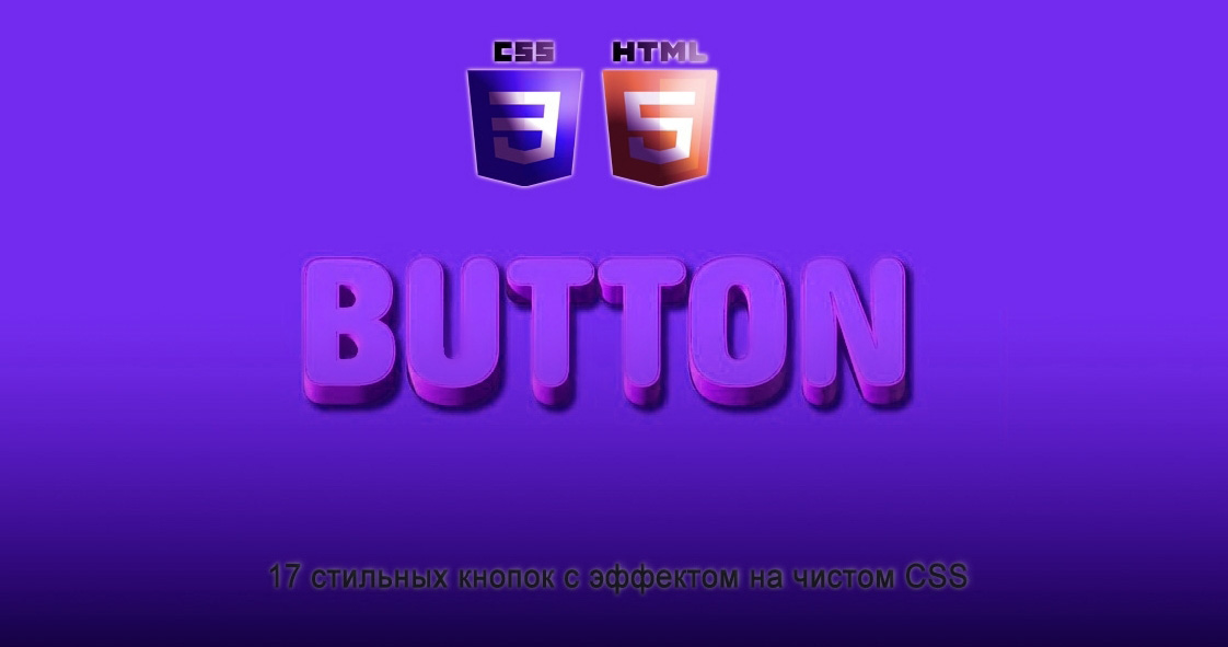 | |
| Просто отличная подборка из 17 эффектов с анимацией для кнопок, где присутствует ховер эффект, который выполнен на чистом CSS. Если говорить про каждую кнопку, то это просто оригинал, который идет с красивой анимацией, где будет неотразим на любом тематическом сайте. По сути здесь кнопок нет, а точнее создан каркас, и так сделано, что под каждое значение написан свой стиль. Вы можете выбрать на странице демонстрации тот эффект который вам так нравится, где в последствии его перенести на свой ресурс. Можно в сети интернет искать каждый эффект, но здесь они самые актуальные, что и безусловно красиво смотрятся при наведении курсора. Есть от простой анимации, то красивой, хотя как уже было сказано, каждый эффект по своему оригинален. Сам дизайн здесь не имеет значение, это то большие и жирные кнопки на главной странице или маленькие и незаметные в нижнем колонтитуле. Здесь сама суть из предназначение данных кнопок являются очень важным элементом дизайна для пользовательского потока на вашем веб-сайте. А это как для корпоративного веб-сайта часто используется более сдержанный дизайн, или понятнее для кого, это более строгий, где анимации по минимум, в то время как креативные индустрии склонны использовать более привлекательные кнопки, что при открытие страницы просто сразу бросаются в глаза, что заметны по своему формату. Чтобы как можно больше задействовать различных тем на интернет площадок, то здесь вы найдете множество разных стилей кнопок. Так самая подборка, что на demo странице:  Установка: HTML Код <div class="frame"> <button class="knopka-clenta clenta-1">Первая</button> <button class="knopka-clenta clenta-2">Вторая</button> <button class="knopka-clenta clenta-3"><span>Третья</span></button> <button class="knopka-clenta clenta-4"><span>Четвертая</span></button> <button class="knopka-clenta clenta-5"><span>Пятая</span></button> <button class="knopka-clenta clenta-6"><span>Шестая</span></button> <button class="knopka-clenta clenta-7"><span>Седьмая</span></button> <button class="knopka-clenta clenta-8"><span>Восьмая</span></button> <button class="knopka-clenta clenta-9">Девятая</button> <button class="knopka-clenta clenta-10">Десять</button> <button class="knopka-clenta clenta-11">Одинацать<div class="dot"></div></button> <button class="knopka-clenta clenta-12"><span>Один</span><span>Два</span></button> <button class="knopka-clenta clenta-13">Тренадцать</button> <button class="knopka-clenta clenta-14">Четырнацать</button> <button class="knopka-clenta clenta-15">Пятнадцать</button> <button class="knopka-clenta clenta-16">Шестнадцать</button> </div> </div> CSS Код .frame { width: 87%; margin: 38px auto; text-align: center; } button { margin: 20px; } .knopka-clenta { width: 130px; height: 40px; color: #fff; border-radius: 5px; padding: 10px 25px; font-family: 'Lato', sans-serif; font-weight: 500; background: transparent; cursor: pointer; transition: all 0.3s ease; position: relative; display: inline-block; box-shadow:inset 2px 2px 2px 0px rgba(255,255,255,.5), 7px 7px 20px 0px rgba(0,0,0,.1), 4px 4px 5px 0px rgba(0,0,0,.1); outline: none; } /* 1 */ .clenta-1 { background: rgb(6,14,131); background: linear-gradient(0deg, rgba(6,14,131,1) 0%, rgba(12,25,180,1) 100%); border: none; } .clenta-1:hover { background: rgb(0,3,255); background: linear-gradient(0deg, rgba(0,3,255,1) 0%, rgba(2,126,251,1) 100%); } /* 2 */ .clenta-2 { background: rgb(96,9,240); background: linear-gradient(0deg, rgba(96,9,240,1) 0%, rgba(129,5,240,1) 100%); border: none; } .clenta-2:before { height: 0%; width: 2px; } .clenta-2:hover { box-shadow: 4px 4px 6px 0 rgba(255,255,255,.5), -4px -4px 6px 0 rgba(116, 125, 136, .5), inset -4px -4px 6px 0 rgba(255,255,255,.2), inset 4px 4px 6px 0 rgba(0, 0, 0, .4); } /* 3 */ .clenta-3 { background: rgb(0,172,238); background: linear-gradient(0deg, rgba(0,172,238,1) 0%, rgba(2,126,251,1) 100%); width: 130px; height: 40px; line-height: 42px; padding: 0; border: none; } .clenta-3 span { position: relative; display: block; width: 100%; height: 100%; } .clenta-3:before, .clenta-3:after { position: absolute; content: ""; right: 0; top: 0; background: rgba(2,126,251,1); transition: all 0.3s ease; } .clenta-3:before { height: 0%; width: 2px; } .clenta-3:after { width: 0%; height: 2px; } .clenta-3:hover{ background: transparent; box-shadow: none; } .clenta-3:hover:before { height: 100%; } .clenta-3:hover:after { width: 100%; } .clenta-3 span:hover{ color: rgba(2,126,251,1); } .clenta-3 span:before, .clenta-3 span:after { position: absolute; content: ""; left: 0; bottom: 0; background: rgba(2,126,251,1); transition: all 0.3s ease; } .clenta-3 span:before { width: 2px; height: 0%; } .clenta-3 span:after { width: 0%; height: 2px; } .clenta-3 span:hover:before { height: 100%; } .clenta-3 span:hover:after { width: 100%; } /* 4 */ .clenta-4 { background-color: #4dccc6; background-image: linear-gradient(315deg, #4dccc6 0%, #96e4df 74%); line-height: 42px; padding: 0; border: none; } .clenta-4:hover{ background-color: #89d8d3; background-image: linear-gradient(315deg, #89d8d3 0%, #03c8a8 74%); } .clenta-4 span { position: relative; display: block; width: 100%; height: 100%; } .clenta-4:before, .clenta-4:after { position: absolute; content: ""; right: 0; top: 0; box-shadow: 4px 4px 6px 0 rgba(255,255,255,.9), -4px -4px 6px 0 rgba(116, 125, 136, .2), inset -4px -4px 6px 0 rgba(255,255,255,.9), inset 4px 4px 6px 0 rgba(116, 125, 136, .3); transition: all 0.3s ease; } .clenta-4:before { height: 0%; width: .1px; } .clenta-4:after { width: 0%; height: .1px; } .clenta-4:hover:before { height: 100%; } .clenta-4:hover:after { width: 100%; } .clenta-4 span:before, .clenta-4 span:after { position: absolute; content: ""; left: 0; bottom: 0; box-shadow: 4px 4px 6px 0 rgba(255,255,255,.9), -4px -4px 6px 0 rgba(116, 125, 136, .2), inset -4px -4px 6px 0 rgba(255,255,255,.9), inset 4px 4px 6px 0 rgba(116, 125, 136, .3); transition: all 0.3s ease; } .clenta-4 span:before { width: .1px; height: 0%; } .clenta-4 span:after { width: 0%; height: .1px; } .clenta-4 span:hover:before { height: 100%; } .clenta-4 span:hover:after { width: 100%; } /* 5 */ .clenta-5 { width: 130px; height: 40px; line-height: 42px; padding: 0; border: none; background: rgb(255,27,0); background: linear-gradient(0deg, rgba(255,27,0,1) 0%, rgba(251,75,2,1) 100%); } .clenta-5:hover { color: #f0094a; background: transparent; box-shadow:none; } .clenta-5:before, .clenta-5:after{ content:''; position:absolute; top:0; right:0; height:2px; width:0; background: #f0094a; box-shadow: -1px -1px 5px 0px #fff, 7px 7px 20px 0px #0003, 4px 4px 5px 0px #0002; transition:400ms ease all; } .clenta-5:after{ right:inherit; top:inherit; left:0; bottom:0; } .clenta-5:hover:before, .clenta-5:hover:after{ width:100%; transition:800ms ease all; } /* 6 */ .clenta-6 { background: rgb(247,150,192); background: radial-gradient(circle, rgba(247,150,192,1) 0%, rgba(118,174,241,1) 100%); line-height: 42px; padding: 0; border: none; } .clenta-6 span { position: relative; display: block; width: 100%; height: 100%; } .clenta-6:before, .clenta-6:after { position: absolute; content: ""; height: 0%; width: 1px; box-shadow: -1px -1px 20px 0px rgba(255,255,255,1), -4px -4px 5px 0px rgba(255,255,255,1), 7px 7px 20px 0px rgba(0,0,0,.4), 4px 4px 5px 0px rgba(0,0,0,.3); } .clenta-6:before { right: 0; top: 0; transition: all 500ms ease; } .clenta-6:after { left: 0; bottom: 0; transition: all 500ms ease; } .clenta-6:hover{ background: transparent; color: #76aef1; box-shadow: none; } .clenta-6:hover:before { transition: all 500ms ease; height: 100%; } .clenta-6:hover:after { transition: all 500ms ease; height: 100%; } .clenta-6 span:before, .clenta-6 span:after { position: absolute; content: ""; box-shadow: -1px -1px 20px 0px rgba(255,255,255,1), -4px -4px 5px 0px rgba(255,255,255,1), 7px 7px 20px 0px rgba(0,0,0,.4), 4px 4px 5px 0px rgba(0,0,0,.3); } .clenta-6 span:before { left: 0; top: 0; width: 0%; height: .5px; transition: all 500ms ease; } .clenta-6 span:after { right: 0; bottom: 0; width: 0%; height: .5px; transition: all 500ms ease; } .clenta-6 span:hover:before { width: 100%; } .clenta-6 span:hover:after { width: 100%; } /* 7 */ .clenta-7 { background: linear-gradient(0deg, rgba(255,151,0,1) 0%, rgba(251,75,2,1) 100%); line-height: 42px; padding: 0; border: none; } .clenta-7 span { position: relative; display: block; width: 100%; height: 100%; } .clenta-7:before, .clenta-7:after { position: absolute; content: ""; right: 0; bottom: 0; background: rgba(251,75,2,1); box-shadow: -7px -7px 20px 0px rgba(255,255,255,.9), -4px -4px 5px 0px rgba(255,255,255,.9), 7px 7px 20px 0px rgba(0,0,0,.2), 4px 4px 5px 0px rgba(0,0,0,.3); transition: all 0.3s ease; } .clenta-7:before{ height: 0%; width: 2px; } .clenta-7:after { width: 0%; height: 2px; } .clenta-7:hover{ color: rgba(251,75,2,1); background: transparent; } .clenta-7:hover:before { height: 100%; } .clenta-7:hover:after { width: 100%; } .clenta-7 span:before, .clenta-7 span:after { position: absolute; content: ""; left: 0; top: 0; background: rgba(251,75,2,1); box-shadow: -7px -7px 20px 0px rgba(255,255,255,.9), -4px -4px 5px 0px rgba(255,255,255,.9), 7px 7px 20px 0px rgba(0,0,0,.2), 4px 4px 5px 0px rgba(0,0,0,.3); transition: all 0.3s ease; } .clenta-7 span:before { width: 2px; height: 0%; } .clenta-7 span:after { height: 2px; width: 0%; } .clenta-7 span:hover:before { height: 100%; } .clenta-7 span:hover:after { width: 100%; } /* 8 */ .clenta-8 { background-color: #f0ecfc; background-image: linear-gradient(315deg, #f0ecfc 0%, #c797eb 74%); line-height: 42px; padding: 0; border: none; } .clenta-8 span { position: relative; display: block; width: 100%; height: 100%; } .clenta-8:before, .clenta-8:after { position: absolute; content: ""; right: 0; bottom: 0; background: #c797eb; /*box-shadow: 4px 4px 6px 0 rgba(255,255,255,.5), -4px -4px 6px 0 rgba(116, 125, 136, .2), inset -4px -4px 6px 0 rgba(255,255,255,.5), inset 4px 4px 6px 0 rgba(116, 125, 136, .3);*/ transition: all 0.3s ease; } .clenta-8:before{ height: 0%; width: 2px; } .clenta-8:after { width: 0%; height: 2px; } .clenta-8:hover:before { height: 100%; } .clenta-8:hover:after { width: 100%; } .clenta-8:hover{ background: transparent; } .clenta-8 span:hover{ color: #c797eb; } .clenta-8 span:before, .clenta-8 span:after { position: absolute; content: ""; left: 0; top: 0; background: #c797eb; /*box-shadow: 4px 4px 6px 0 rgba(255,255,255,.5), -4px -4px 6px 0 rgba(116, 125, 136, .2), inset -4px -4px 6px 0 rgba(255,255,255,.5), inset 4px 4px 6px 0 rgba(116, 125, 136, .3);*/ transition: all 0.3s ease; } .clenta-8 span:before { width: 2px; height: 0%; } .clenta-8 span:after { height: 2px; width: 0%; } .clenta-8 span:hover:before { height: 100%; } .clenta-8 span:hover:after { width: 100%; } /* 9 */ .clenta-9 { border: none; transition: all 0.3s ease; overflow: hidden; } .clenta-9:after { position: absolute; content: " "; z-index: -1; top: 0; left: 0; width: 100%; height: 100%; background-color: #1fd1f9; background-image: linear-gradient(315deg, #1fd1f9 0%, #b621fe 74%); transition: all 0.3s ease; } .clenta-9:hover { background: transparent; box-shadow: 4px 4px 6px 0 rgba(255,255,255,.5), -4px -4px 6px 0 rgba(116, 125, 136, .2), inset -4px -4px 6px 0 rgba(255,255,255,.5), inset 4px 4px 6px 0 rgba(116, 125, 136, .3); color: #fff; } .clenta-9:hover:after { -webkit-transform: scale(2) rotate(180deg); transform: scale(2) rotate(180deg); box-shadow: 4px 4px 6px 0 rgba(255,255,255,.5), -4px -4px 6px 0 rgba(116, 125, 136, .2), inset -4px -4px 6px 0 rgba(255,255,255,.5), inset 4px 4px 6px 0 rgba(116, 125, 136, .3); } /* 10 */ .clenta-10 { background: rgb(22,9,240); background: linear-gradient(0deg, rgba(22,9,240,1) 0%, rgba(49,110,244,1) 100%); color: #fff; border: none; transition: all 0.3s ease; overflow: hidden; } .clenta-10:after { position: absolute; content: " "; top: 0; left: 0; z-index: -1; width: 100%; height: 100%; transition: all 0.3s ease; -webkit-transform: scale(.1); transform: scale(.1); } .clenta-10:hover { color: #fff; border: none; background: transparent; } .clenta-10:hover:after { background: rgb(0,3,255); background: linear-gradient(0deg, rgba(2,126,251,1) 0%, rgba(0,3,255,1)100%); -webkit-transform: scale(1); transform: scale(1); } /* 11 */ .clenta-11 { border: none; background: rgb(251,33,117); background: linear-gradient(0deg, rgba(251,33,117,1) 0%, rgba(234,76,137,1) 100%); color: #fff; overflow: hidden; } .clenta-11:hover { text-decoration: none; color: #fff; } .clenta-11:before { position: absolute; content: ''; display: inline-block; top: -180px; left: 0; width: 30px; height: 100%; background-color: #fff; animation: shiny-btn1 3s ease-in-out infinite; } .clenta-11:hover{ opacity: .7; } .clenta-11:active{ box-shadow: 4px 4px 6px 0 rgba(255,255,255,.3), -4px -4px 6px 0 rgba(116, 125, 136, .2), inset -4px -4px 6px 0 rgba(255,255,255,.2), inset 4px 4px 6px 0 rgba(0, 0, 0, .2); } @-webkit-keyframes shiny-btn1 { 0% { -webkit-transform: scale(0) rotate(45deg); opacity: 0; } 80% { -webkit-transform: scale(0) rotate(45deg); opacity: 0.5; } 81% { -webkit-transform: scale(4) rotate(45deg); opacity: 1; } 100% { -webkit-transform: scale(50) rotate(45deg); opacity: 0; } } /* 12 */ .clenta-12{ position: relative; right: 20px; bottom: 20px; border:none; box-shadow: none; width: 130px; height: 40px; line-height: 42px; -webkit-perspective: 230px; perspective: 230px; } .clenta-12 span { background: rgb(0,172,238); background: linear-gradient(0deg, rgba(0,172,238,1) 0%, rgba(2,126,251,1) 100%); display: block; position: absolute; width: 130px; height: 40px; box-shadow:inset 2px 2px 2px 0px rgba(255,255,255,.5), 7px 7px 20px 0px rgba(0,0,0,.1), 4px 4px 5px 0px rgba(0,0,0,.1); border-radius: 5px; margin:0; text-align: center; -webkit-box-sizing: border-box; -moz-box-sizing: border-box; box-sizing: border-box; -webkit-transition: all .3s; transition: all .3s; } .clenta-12 span:nth-child(1) { box-shadow: -7px -7px 20px 0px #fff9, -4px -4px 5px 0px #fff9, 7px 7px 20px 0px #0002, 4px 4px 5px 0px #0001; -webkit-transform: rotateX(90deg); -moz-transform: rotateX(90deg); transform: rotateX(90deg); -webkit-transform-origin: 50% 50% -20px; -moz-transform-origin: 50% 50% -20px; transform-origin: 50% 50% -20px; } .clenta-12 span:nth-child(2) { -webkit-transform: rotateX(0deg); -moz-transform: rotateX(0deg); transform: rotateX(0deg); -webkit-transform-origin: 50% 50% -20px; -moz-transform-origin: 50% 50% -20px; transform-origin: 50% 50% -20px; } .clenta-12:hover span:nth-child(1) { box-shadow:inset 2px 2px 2px 0px rgba(255,255,255,.5), 7px 7px 20px 0px rgba(0,0,0,.1), 4px 4px 5px 0px rgba(0,0,0,.1); -webkit-transform: rotateX(0deg); -moz-transform: rotateX(0deg); transform: rotateX(0deg); } .clenta-12:hover span:nth-child(2) { box-shadow:inset 2px 2px 2px 0px rgba(255,255,255,.5), 7px 7px 20px 0px rgba(0,0,0,.1), 4px 4px 5px 0px rgba(0,0,0,.1); color: transparent; -webkit-transform: rotateX(-90deg); -moz-transform: rotateX(-90deg); transform: rotateX(-90deg); } /* 13 */ .clenta-13 { background-color: #89d8d3; background-image: linear-gradient(315deg, #89d8d3 0%, #03c8a8 74%); border: none; z-index: 1; } .clenta-13:after { position: absolute; content: ""; width: 100%; height: 0; bottom: 0; left: 0; z-index: -1; border-radius: 5px; background-color: #4dccc6; background-image: linear-gradient(315deg, #4dccc6 0%, #96e4df 74%); box-shadow: -7px -7px 20px 0px #fff9, -4px -4px 5px 0px #fff9, 7px 7px 20px 0px #0002, 4px 4px 5px 0px #0001; transition: all 0.3s ease; } .clenta-13:hover { color: #fff; } .clenta-13:hover:after { top: 0; height: 100%; } .clenta-13:active { top: 2px; } /* 14 */ .clenta-14 { background: rgb(255,151,0); border: none; z-index: 1; } .clenta-14:after { position: absolute; content: ""; width: 100%; height: 0; top: 0; left: 0; z-index: -1; border-radius: 5px; background-color: #eaf818; background-image: linear-gradient(315deg, #eaf818 0%, #f6fc9c 74%); box-shadow:inset 2px 2px 2px 0px rgba(255,255,255,.5); 7px 7px 20px 0px rgba(0,0,0,.1), 4px 4px 5px 0px rgba(0,0,0,.1); transition: all 0.3s ease; } .clenta-14:hover { color: #000; } .clenta-14:hover:after { top: auto; bottom: 0; height: 100%; } .clenta-14:active { top: 2px; } /* 15 */ .clenta-15 { background: #b621fe; border: none; z-index: 1; } .clenta-15:after { position: absolute; content: ""; width: 0; height: 100%; top: 0; right: 0; z-index: -1; background-color: #663dff; border-radius: 5px; box-shadow:inset 2px 2px 2px 0px rgba(255,255,255,.5), 7px 7px 20px 0px rgba(0,0,0,.1), 4px 4px 5px 0px rgba(0,0,0,.1); transition: all 0.3s ease; } .clenta-15:hover { color: #fff; } .clenta-15:hover:after { left: 0; width: 100%; } .clenta-15:active { top: 2px; } /* 16 */ .clenta-16 { border: none; color: #000; } .clenta-16:after { position: absolute; content: ""; width: 0; height: 100%; top: 0; left: 0; direction: rtl; z-index: -1; box-shadow: -7px -7px 20px 0px #fff9, -4px -4px 5px 0px #fff9, 7px 7px 20px 0px #0002, 4px 4px 5px 0px #0001; transition: all 0.3s ease; } .clenta-16:hover { color: #000; } .clenta-16:hover:after { left: auto; right: 0; width: 100%; } .clenta-16:active { top: 2px; } Данные кнопки не только хороши для удобства использования их по прямому назначению, но и являются чрезвычайно важным элементом дизайна вашего сайта. И теперь вы можете подобрать тот элемент анимации, который будет соответствовать вашему стилю на сайте, а выбрать есть реально из чего. Так как данный набор содержит семнадцать неповторимых эффектов, которые преобразуют ресурс. Демонстрация | |
14 Марта 2023 Загрузок: 2 Просмотров: 995
Поделиться в социальных сетях
Материал разместил