|
Примеры анимации текста для сайта на CSS
|
|
Kosten |
Четверг, 06 Мая 2021, 21:45 | Сообщение 1 |

|
Тема предназначена для подборки разных красивых эффектов, которые производятся на тексте, что смотрится красиво на любом сайте. Здесь представлены просто потрясающие текстовые анимации, которые можно задействовать в своих веб-проектах. Где безусловно пойдет как элемент дизайна, плюс анимация, которая исполнена на чистом CSS.
Здесь идет стильная подборка красивой и текстовой анимации, которую можно наблюдать на светлом или на темном формате, ведь все можно по цветовой гамме самостоятельно поставить. Также можете найти красивую анимацию, которая идет к знакам или словам, где некоторые варианты созданы на чистом CSS для текстового эффекта.
|
| [ RU ] |
|
|
Kosten |
Четверг, 06 Мая 2021, 21:54 | Сообщение 2 |
|
|
Анимация букв и знаков, которые появляются по очереди, что выглядит оригинально.
HTML
Код <div class="container">
<h1 class="heading">ZorNet.Ru — сайт для вебмастера</h1>
</div>
CSS
Код .container{
display: flex;
justify-content: center;
align-items: center;
height: 100vh;
}
.heading{
letter-spacing: 1rem;
font-family: fantasy;
color: blue;
}
span{
display: inline-block;
opacity: 0;
transform: translateY(-100%);
transition: all 0.4s ease-in-out
}
.fade{
opacity: 1;
transform: translateY(0);
}
JS
Код const heading = document.querySelector('.heading');
const characters = heading.textContent.match(/[\w\W]/g); //Get the texts and create an array.
heading.textContent = ''; //Empty the contents.
characters.forEach(char => {
const span = document.createElement('span');
span.textContent = char;
heading.appendChild(span);
});
// Create charcter count variable and set timer with new function called setChar().
let char = 0;
let timer = setInterval(setChar, 100);
function setChar(){
const spanChar = document.querySelectorAll('span')[char];
spanChar.className = 'fade';
char++;
char === characters.length && clearInterval(timer);
}
|
| [ RU ] |
|
|
Kosten |
Четверг, 06 Мая 2021, 22:06 | Сообщение 3 |
|
|
Фрагмент анимации нарезанного текста HTML + CSS
HTML
Код <div class="deconstructed">
ZorNet.Ru
<div>ZorNet.Ru</div>
<div>ZorNet.Ru</div>
<div>ZorNet.Ru</div>
<div>ZorNet.Ru</div>
</div>
CSS
Код .deconstructed {
position: relative;
margin: auto;
height: 0.71em;
color: transparent;
font-family: 'Cambay', sans-serif;
font-size: 10vw;
font-weight: 700;
letter-spacing: -0.02em;
line-height: 1.03em;
}
.deconstructed > div {
position: absolute;
top: 0;
left: 0;
right: 0;
bottom: 0;
color: #ffff64;
pointer-events: none;
}
.deconstructed > div:nth-child(1) {
-webkit-mask-image: linear-gradient(black 25%, transparent 25%);
mask-image: linear-gradient(black 25%, transparent 25%);
animation: deconstructed1 5s infinite;
}
.deconstructed > div:nth-child(2) {
-webkit-mask-image: linear-gradient(transparent 25%, black 25%, black 50%, transparent 50%);
mask-image: linear-gradient(transparent 25%, black 25%, black 50%, transparent 50%);
animation: deconstructed2 5s infinite;
}
.deconstructed > div:nth-child(3) {
-webkit-mask-image: linear-gradient(transparent 50%, black 50%, black 75%, transparent 75%);
mask-image: linear-gradient(transparent 50%, black 50%, black 75%, transparent 75%);
animation: deconstructed3 5s infinite;
}
.deconstructed > div:nth-child(4) {
-webkit-mask-image: linear-gradient(transparent 75%, black 75%);
mask-image: linear-gradient(transparent 75%, black 75%);
animation: deconstructed4 5s infinite;
}
@keyframes deconstructed1 {
0% {
transform: translateX(100%);
}
26% {
transform: translateX(0%);
}
83% {
transform: translateX(-0.1%);
}
100% {
transform: translateX(-120%);
}
}
@keyframes deconstructed2 {
0% {
transform: translateX(100%);
}
24% {
transform: translateX(0.5%);
}
82% {
transform: translateX(-0.2%);
}
100% {
transform: translateX(-125%);
}
}
@keyframes deconstructed3 {
0% {
transform: translateX(100%);
}
22% {
transform: translateX(0%);
}
81% {
transform: translateX(0%);
}
100% {
transform: translateX(-130%);
}
}
@keyframes deconstructed4 {
0% {
transform: translateX(100%);
}
20% {
transform: translateX(0%);
}
80% {
transform: translateX(0%);
}
100% {
transform: translateX(-135%);
}
}
|
| [ RU ] |
|
|
Kosten |
Четверг, 06 Мая 2021, 22:16 | Сообщение 4 |
|
|
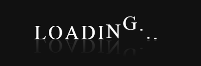
Анимация волнистый текст при исполнение CSS

HTML
Код <body>
<div class="waviy">
<span style="--i:1">L</span>
<span style="--i:2">o</span>
<span style="--i:3">a</span>
<span style="--i:4">d</span>
<span style="--i:5">i</span>
<span style="--i:6">n</span>
<span style="--i:7">g</span>
<span style="--i:8">.</span>
<span style="--i:9">.</span>
<span style="--i:10">.</span>
</div>
</body>
CSS
Код .waviy {
position: relative;
-webkit-box-reflect: below -20px linear-gradient(transparent, rgba(0,0,0,.2));
}
.waviy span {
position: relative;
display: inline-block;
font-size: 40px;
color: #fff;
text-transform: uppercase;
animation: waviy 1s infinite;
animation-delay: calc(.1s * var(--i))
}
@keyframes waviy {
0%,40%,100% {
transform: translateY(0)
}
20% {
transform: translateY(-20px)
}
}
|
| [ RU ] |
|
|
Kosten |
Четверг, 06 Мая 2021, 22:20 | Сообщение 5 |
|
|
Переворот текстовой анимации при исполнение CSS

HTML
Код <body>
<div class="waviy">
<span style="--i:1">L</span>
<span style="--i:2">o</span>
<span style="--i:3">a</span>
<span style="--i:4">d</span>
<span style="--i:5">i</span>
<span style="--i:6">n</span>
<span style="--i:7">g</span>
<span style="--i:8">.</span>
</div>
</body>
CSS
Код .waviy {
position: relative;
}
.waviy span {
position: relative;
display: inline-block;
font-size: 40px;
color: #fff;
text-transform: uppercase;
animation: flip 2s infinite;
animation-delay: calc(.2s * var(--i))
}
@keyframes flip {
0%,80% {
transform: rotateY(360deg)
}
}
|
| [ RU ] |
|
|
Kosten |
Четверг, 06 Мая 2021, 22:39 | Сообщение 6 |
|
|
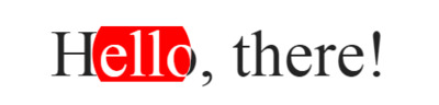
Текстовая анимация по траектории знаков на HTML + CSS
HTML
Код <div class="bottom-container">
Hello, there!
</div>
<div class="top-container">
Hello, there!
</div>
CSS
Код .bottom-container,
.top-container {
width: 40vw;
height: 35vh;
display: flex;
justify-content: center;
align-items: center;
position: fixed;
top: 35vh;
left: 30vw;
padding: 1vw;
}
.bottom-container {
color: #232323;
}
.top-container {
background-color: red;
color: white;
clip-path: circle(13% at 85% 50%);
animation: circleMove 100s ease-in-out infinite;
}
@keyframes circleMove {
0%, 100% {
clip-path: circle(13% at 85% 50%);
}
50% {
clip-path: circle(13% at 15% 50%);
}
}
|
| [ RU ] |
|
|
Kosten |
Четверг, 06 Мая 2021, 22:46 | Сообщение 7 |
|
|
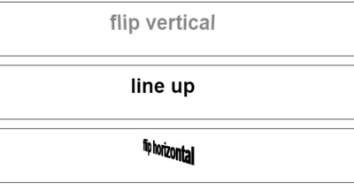
Базовая анимация текста на чистом CSS, которая отлично подойдет под оформление сайта.
HTML
Код <body>
<div class='line'>
<h2 class='flipX'>flip vertical</h2>
</div>
<div class="line">
<h2 class='lineUp'>line up</h2>
</div>
<div class='line'>
<h2 class='flipY'>flip horizontal</h2>
</div>
<div class='line'>
<h2 class='pop-outin'>text pop-out-in</h2>
</div>
</body>
CSS
Код h2 {
text-align: center;
padding: 16px;
margin: 0;
}
/* crops animations that exceeds one line area */
.line {
width: 100%;
height: 4rem;
overflow: hidden;
border: 1px solid black;
padding: 0;
margin-bottom: 16px;
}
/* flipping class and key frames*/
.flipX {
animation: 1s anim-flipX ease infinite;
}
@keyframes anim-flipX {
0% {
opacity: 0;
transform: rotateX(90def);
}
50% {
opacity: 1;
transform: rotateX(720deg);
}
100% {
/* animate nothing to pause animation at the end */
opacity: 1;
transform: rotateX(720deg);
}
}
/* lineup class and keyframes */
.lineUp {
animation: 2s anim-lineUp ease-out infinite;
}
@keyframes anim-lineUp {
0% {
opacity: 0;
transform: translateY(80%);
}
20% {
opacity: 0;
}
50% {
opacity: 1;
transform: translateY(0%);
}
100% {
opacity: 1;
transform: translateY(0%);
}
}
/* flipY class and keyframes*/
.flipY {
animation-name: spin, depth;
animation-timing-function: linear;
animation-iteration-count: infinite;
animation-duration: 6s;
}
@keyframes spin {
0% {
transform: rotateY(0deg);
}
100% {
transform: rotateY(-360deg);
}
}
@keyframes depth {
0% {
text-shadow: 0 0 black;
}
25% {
text-shadow: 1px 0 black, 2px 0 black, 3px 0 black, 4px 0 black, 5px 0 black;
}
50% {
text-shadow: 0 0 black;
}
75% {
text-shadow: -1px 0 black, -2px 0 black, -3px 0 black, -4px 0 black,
-5px 0 black;
}
100% {
text-shadow: 0 0 black;
}
}
/* subtle zoom to attention and then back */
.pop-outin {
animation: 2s anim-popoutin ease infinite;
}
@keyframes anim-popoutin {
0% {
color: black;
transform: scale(0);
opacity: 0;
text-shadow: 0 0 0 rgba(0, 0, 0, 0);
}
25% {
color: red;
transform: scale(2);
opacity: 1;
text-shadow: 3px 10px 5px rgba(0, 0, 0, 0.5);
}
50% {
color: black;
transform: scale(1);
opacity: 1;
text-shadow: 1px 0 0 rgba(0, 0, 0, 0);
}
100% {
/* animate nothing to add pause at the end of animation */
transform: scale(1);
opacity: 1;
text-shadow: 1px 0 0 rgba(0, 0, 0, 0);
}
}
.fromtop {
animation: 2s anim-fromtop linear infinite;
}
@keyframes anim-fromtop {
0% { opacity: 0; transform: translateY(-100%);}
25% { opacity: 1; transform: translateY(0%);}
50% {
}
100% {
}
}
|
| [ RU ] |
|
|
Kosten |
Четверг, 06 Мая 2021, 22:56 | Сообщение 8 |
|
|
Эффект текстовой анимации, где можно подчеркнуть те знаки, которые вам нужно показать, так как они поменяют фон на некоторое время.
Красивый эффект текстовой анимации со сменой слов

HTML
Код <h1>
<span>ZorNet.Ru</span>
<div class="message">
<div class="word1">close</div>
<div class="word2">code</div>
<div class="word3">creating</div>
</div>
</h1>
CSS
Код h1 {
color: #333;
font-family: tahoma;
font-size: 3rem;
font-weight: 100;
line-height: 1.5;
text-transform: uppercase;
white-space: nowrap;
overflow: hidden;
position: relative;
width: 550px;
}
h1 span {
font-size: 40px;
margin-left: 40px;
}
.message {
background-color: yellow;
color: #333;
display: block;
font-weight: 900;
overflow: hidden;
position: absolute;
padding-left: 0.5rem;
top: 0.2rem;
left: 270px;
animation: openclose 5s ease-in-out infinite;
}
.word1, .word2, .word3 {
font-family: tahoma;
}
@keyframes openclose {
0% {
top: 0.2rem;
width: 0;
}
5% {
width: 0;
}
15% {
width: 230px;
}
30% {
top: 0.2rem;
width: 230px;
}
33% {
top: 0.2rem;
width: 0;
}
35% {
top: 0.2rem;
width: 0;
}
38% {
top: -4.5rem;
}
48% {
top: -4.5rem;
width: 190px;
}
62% {
top: -4.5rem;
width: 190px;
}
66% {
top: -4.5rem;
width: 0;
text-indent: 0;
}
71% {
top: -9rem;
width: 0;
text-indent: 5px;
}
86% {
top: -9rem;
width: 285px;
}
95% {
top: -9rem;
width: 285px;
}
98% {
top: -9rem;
width: 0;
text-indent: 5px;
}
100% {
top: 0;
width: 0;
text-indent: 0;
}
}
|
| [ RU ] |
|
|