|
Анимированные кнопки на чистом CSS + HTML5
|
|
Kosten |
Суббота, 30 Января 2021, 23:32 | Сообщение 1 |

|
Решили придать своему сайту оригинальности, чтоб сделать его красивым, то можно начать с кнопок, которые будут отлично дополнять основной стиль сайта. Их можно задействовать под разные функции, это как переход на другую страницу или сделать, чтоб при нажатие запустить скачивание файла.
Они созданы на чистом CSS, где идет стилистика CSS3, которую самостоятельно можно изменить по оттенку цвета, так, чтоб отлично влился в основу современного дизайна. Эта уже вторая партия кнопок, где первая подборка кнопок на CSS можете посмотреть, там представлена большая подборка разного дизайна.

HTML
Код <button class="dukasmun-lopdsab">
<div class="gedsamopan"></bg>
</button>
CSS
Код .dukasmun-lopdsab {
-webkit-touch-callout: none;
-webkit-user-select: none;
-khtml-user-select: none;
-moz-user-select: none;
-ms-user-select: none;
user-select: none;
-webkit-tap-highlight-color: transparent;
}
button {
width: 150px;
height: 50px;
cursor: pointer;
background: none;
border: 2px solid rgba(255,255,255,0.4);
border-radius: 5px;
display: flex;
align-items: center;
justify-content: center;
overflow: hidden;
transition: 500ms;
}
button:after {
content: 'Parallel';
position: absolute;
color: white;
transition: 500ms;
}
.gedsamopan {
width: 0px;
height: 50px;
content: '';
z-index: -1;
background: rgba(255,255,255,0.2);
transform: skewX(45deg);
transition: 500ms;
}
button:hover {
border: 2px solid rgba(255,255,255,0.8);
}
button:hover .gedsamopan {
background: rgba(255,255,255,0.8);
width: 150px;
}
button:hover:after {
color: black;
}
button:focus {
outline: none;
}
Как понимаете, что здесь в основе представлена сама анимация, где вам остается прописать под кнопку.
Демонстрация
|
| [ RU ] |
|
|
Kosten |
Суббота, 30 Января 2021, 23:39 | Сообщение 2 |
|
|
Это простая кнопка, которая выполнена на чистом CSS, где при наведение на основание появится светло зеленая палитра, что на темном или светлом фоне смотрится великолепно.

HTML
Код <button class="name noselect"></button>
CSS
Код .noselect {
-webkit-touch-callout: none;
-webkit-user-select: none;
-khtml-user-select: none;
-moz-user-select: none;
-ms-user-select: none;
user-select: none;
-webkit-tap-highlight-color: transparent;
}
button {
width: 150px;
height: 50px;
cursor: pointer;
display: flex;
align-items: center;
justify-content: center;
transform: skewX(-15deg);
border: none;
background: rgb(0,18,74);
background: linear-gradient(90deg, rgba(20,20,20,1) 50%, rgba(155,255,118,1) 50%);
background-size: 205% 100%;
background-repeat: no-repeat;
background-position: left;
transition: 1s;
}
button:before {
width: 140px;
height: 40px;
background: rgba(255,255,255,0.5);
content: 'ZORNET.RU';
color: rgba(20,20,20,1);
position: absolute;
display: flex;
align-items: center;
justify-content: center;
transition: 500ms;
}
button:hover {
background-position: right;
}
button:hover:before {
color: rgba(155,255,118,1);
background: rgba(0,0,0,0.8);
}
button:focus {
outline: none;
}
Ниже предоставлена демонстрация эффекта при наведении.
See the Pen
Angled by Kocsten (@kocsten)
on CodePen.
|
| [ RU ] |
|
|
Kosten |
Суббота, 30 Января 2021, 23:47 | Сообщение 3 |
|
|
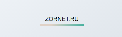
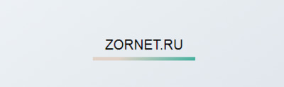
Анимационная кнопка на чистом CSS + HTML с красивым подчеркиванием, где идет только ключевое слово и кнопка по левой стороне. Но только стоит навести курсор, как все быстро меняется, из точки появляется подчеркивание.
HTML
Код <button class="name noselect">ZORNET.RU</button>
CSS
Код .noselect {
-webkit-touch-callout: none;
-webkit-user-select: none;
-khtml-user-select: none;
-moz-user-select: none;
-ms-user-select: none;
user-select: none;
-webkit-tap-highlight-color: transparent;
}
button {
width: 150px;
height: 50px;
cursor: pointer;
font-size: 20px;
background: none;
border: none;
display: flex;
align-items: center;
justify-content: center;
}
button:after {
height: 10px;
width: 10px;
content: '';
background-color: #44b09e;
background-image: linear-gradient(315deg, #44b09e 0%, #e0d2c7 74%);
position: absolute;
transform: translateX(-70px) translateY(0px);
}
button:hover:after {
animation: animate 500ms linear forwards;
}
@keyframes animate {
75% {width: 10px;
height: 10px;
transform: translateX(-70px) translateY(20px);}
100% {width: 150px;
height: 5px;
transform: translateX(0px) translateY(20px);}
}
button:focus {
outline: none;
}
На этом вся установка, где ниже присутствует демонстрация этой кнопки.
See the Pen
underline by Kocsten (@kocsten)
on CodePen.
|
| [ RU ] |
|
|
Kosten |
Воскресенье, 31 Января 2021, 00:00 | Сообщение 4 |
|
|
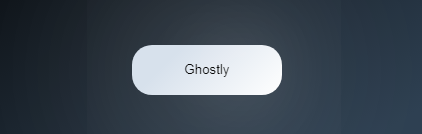
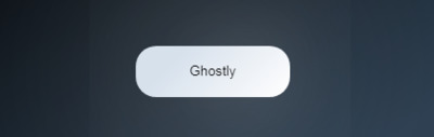
Призрачный стиль кнопки, где при наведение она кардинально меняется по своему стилю, а также идет вокруг красивое освещение. Что изначально созданы под темный сайты, но можно самостоятельно поменять и выставить тени под светлый формат.
HTML
Код <button class="noselect">ZORNET.RU</button>
CSS
Код .noselect {
-webkit-touch-callout: none;
-webkit-user-select: none;
-khtml-user-select: none;
-moz-user-select: none;
-ms-user-select: none;
user-select: none;
-webkit-tap-highlight-color: transparent;
}
button {
width: 150px;
height: 50px;
cursor: pointer;
background-color: #ffffff;
border: none;
border-radius: 20px;
background-image: linear-gradient(315deg, #ffffff 0%, #d7e1ec 74%);
box-shadow: 0 0 200px rgba(255,255,255,0.0);
filter: brightness(0.5);
transition: 1s;
display: flex;
align-items: center;
justify-content: center;
}
button:after {
position: absolute;
content: '';
width: 25px;
height: 25px;
border-radius: 100%;
background: transparent;
box-shadow: 0 0 80px rgba(255,255,255,1);
}
button:hover {
filter: brightness(1);
box-shadow: 0 0 200px rgba(255,255,255,1);
}
button:hover:after {
animation: animate 3s infinite linear;
}
button:focus {
outline: none;
}
@keyframes animate {
0% { transform: translateX(60px)}
50% {transform: translateX(-60px)}
100% {transform: translateX(60px)}
}
Установочный процесс закончен.
See the Pen
Ghostly by Kocsten (@kocsten)
on CodePen.
|
| [ RU ] |
|
|
Kosten |
Воскресенье, 31 Января 2021, 00:39 | Сообщение 5 |
|
|
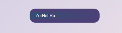
Интересное решение в анимации для кнопки, что с наведением клика происходит сдвиг текста или ключевого слова, что написано по вверх кнопки. Если раньше мы меняли оттенки цвета, то здесь анимация идет только на знаки, что прописать нужно в CSS.
Установка
HTML
Код <button class="name akoreb-sanga"></button>
CSS
Код .akoreb-sanga {
-webkit-touch-callout: none;
-webkit-user-select: none;
-khtml-user-select: none;
-moz-user-select: none;
-ms-user-select: none;
user-select: none;
-webkit-tap-highlight-color: transparent;
}
button {
width: 250px;
height: 50px;
position: relative;
display: flex;
align-items: center;
justify-content: center;
cursor: pointer;
border: none;
border-radius: 20px;
color: white;
font-size: 15px;
background-color: #4c4177;
background-image: linear-gradient(315deg, #4c4177 0%, #2a5470 74%);
background-size: 200% 50%;
background-repeat: no-repeat;
background-position: right;
}
button, button:before {
transition: 1s;
}
button:before {
content: 'ZorNet.Ru';
position: absolute;
transform: translateX(-100%);
}
button:hover:before {
transform: translateX(100%);
}
button:hover {
background-position: left;
background-color: #2a5470;
}
button:focus {
outline: none;
}
Демонстрация
See the Pen
Shift by Kocsten (@kocsten)
on CodePen.
|
| [ RU ] |
|
|
Kosten |
Пятница, 05 Февраля 2021, 20:57 | Сообщение 6 |
|
|
Здесь представлено 3 кнопки, которые подключены на эффект цветового градиента, где можно все их установить на сайт. Ведь у каждого элемента кнопки идет отдельный класс, что по умолчанию они изначально в разном оттенке идут, где аналогично прописан градиент по всей форме дизайна.
Так выглядят при открытие страницы:

Установка:
HTML
Код <button class="anemasua knopka1">ZorNet.Ru</button>
<button class="anemasua knopka2">ZorNet.Ru</button>
<button class="anemasua knopka3">ZorNet.Ru</button>
CSS
Код .anemasua {
-webkit-touch-callout: none;
-webkit-user-select: none;
-khtml-user-select: none;
-moz-user-select: none;
-ms-user-select: none;
user-select: none;
-webkit-tap-highlight-color: transparent;
}
button {
width: 150px;
height: 50px;
margin: 5px;
color: white;
text-shadow: 1px 1px 2px rgba(0,0,0,0.4);
font-size: 16px;
letter-spacing: 2px;
cursor: pointer;
border: none;
border-radius: 20px;
box-shadow: 0px 0px 5px rgba(0,0,0,0.3);
background-size: 200% 100%;
background-position: left;
transition: 500ms;
}
.knopka1 {
background-color: #fff000;
background-image: linear-gradient(315deg, #fff000 0%, #ed008c 74%);
}
.knopka2 {
background-color: 55d284;
background-image: linear-gradient(315deg, #f2cf07 0%, #55d284 50%);
}
.knopka3 {
background-color: #5de6de;
background-image: linear-gradient(315deg, #5de6de 0%, #b58ecc 74%);
}
button:hover {
transform: translateX(5px);
box-shadow: -5px 0px 5px rgba(0,0,0,0.2);
background-position: right;
}
button:focus {
outline: none;
}
На этом установка завершена.
See the Pen
Nice css by Kocsten (@kocsten)
on CodePen.
|
| [ RU ] |
|
|