Kosten |
Среда, 27 Ноября 2019, 23:44 | Сообщение 1 |

|
Сага звездные войны развязала невероятную силу в мире кино, который популярен во многие другие творческие области. Этот фрагмент кода копирует вступительный текст «Звездных войн», поскольку он прокручивается вверх, наклоняясь от зрителя.
Звёздные войны: 3D-прокрутка текста в CSS3 (с музыкой)
HTML
Код <div style="overflow:hidden; position:absolute; left:0; top:0; width:50px; height:25px;">
<div style="margin-top:-290px;">
<object width="420" height="315">
<param name="movie" value="https://www.youtube.com/v/EjMNNpIksaI?version=3&hl=en_US&autoplay=1&autohide=2"></param>
<param name="allowFullScreen" value="true"></param>
<param name="allowscriptaccess" value="always"></param>
<embed src="https://www.youtube.com/v/EjMNNpIksaI?version=3&hl=en_US&autoplay=1&autohide=2" type="application/x-shockwave-flash" width="420" height="315" allowscriptaccess="always" allowfullscreen="true"></embed>
</object>
</div>
</div>
<p id="start">A short time ago in a browser very, very close…</p>
<h1>STAR WARS<sub>titles in CSS3</sub></h1>
<div id="titles">
<div id="titlecontent">
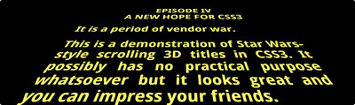
<p class="center">EPISODE IV
A NEW HOPE FOR CSS3</p>
<p>It is a period of vendor war.</p>
<p>This is a demonstration of Star Wars-style scrolling 3D titles in CSS3. It possibly has no practical purpose whatsoever but it looks great and you can impress your friends.</p>
<p>Before movie-buffs start ranting, I realize Star Wars wasn't the first to use crawling 3D titles, but few of you will remember the Flash Gordon series or the 1936 adaption of HG Wells' "Things to Come".</p>
<p>Also, by mentioning "Star Wars", everyone will understand what I mean. And I'll receive several thousand more visits.</p>
<p>The scrolling titles work well in Chrome, Safari and Firefox. Opera doesn't implement 3D transforms yet, but the text will scroll. IE users receive a blank page. A shame, but IE10 should support it.</p>
<p>So how does it work? Well, it's fairly simple. We have an outer absolute DIV (#titles) which is rotated along the X-axis using perspective to give the impression of depth. The same DIV also has an :after psuedo-element which applies a linear gradient so the text appears to fade out.</p>
<p>Inside, we have another absolutely-positioned DIV which contains the text (#titlecontent). The top is set to 100% to ensure it starts off-screen then uses CSS3 animation to move it upward over time. No JavaScript is required.</p>
<p>You will probably need to adjust the movement amount and timing depending on the quantity of text you want to show. The 3D depth can also be tweaked in the #titles declaration.</p>
<p>All the code is contained in this single HTML file…</p>
<p class="center">View the source, Luke!</p>
<p>Sorry. Couldn't resist it.</p>
<p>You're welcome to use this demonstration code in your own sites. Please link back to the original article at:</p>
<p class="center"><a href="http://www.sitepoint.com/css3-starwars-scrolling-text/">sitepoint.com/
css3-starwars-scrolling-text/</a></p>
<p>and give me a shout on Twitter <a href="https://twitter.com/craigbuckler">@craigbuckler</a> – I'd love to see how you use and abuse it!</p>
<p>Finally, Han shot first and the original, unadulterated movies remain the best. Stop fiddling with them, George!</p>
</div>
</div>
<iframe style="visibility:hidden" width="560" height="315" src="https://www.youtube.com/embed/1KAOq7XX2OY" frameborder="0" allowfullscreen></iframe>
CSS
Код @import url(https://fonts.googleapis.com/css?family=Droid+Sans:400,700);
* { padding: 0; margin: 0; }
body, html
{
width: 100%;
height: 100%;
font-family: "Droid Sans", arial, verdana, sans-serif;
font-weight: 700;
color: #ff6;
background-color: #000;
overflow: hidden;
}
p#start
{
position: relative;
width: 16em;
font-size: 200%;
font-weight: 400;
margin: 20% auto;
color: #4ee;
opacity: 0;
z-index: 1;
-webkit-animation: intro 2s ease-out;
-moz-animation: intro 2s ease-out;
-ms-animation: intro 2s ease-out;
-o-animation: intro 2s ease-out;
animation: intro 2s ease-out;
}
@-webkit-keyframes intro {
0% { opacity: 1; }
90% { opacity: 1; }
100% { opacity: 0; }
}
@-moz-keyframes intro {
0% { opacity: 1; }
90% { opacity: 1; }
100% { opacity: 0; }
}
@-ms-keyframes intro {
0% { opacity: 1; }
90% { opacity: 1; }
100% { opacity: 0; }
}
@-o-keyframes intro {
0% { opacity: 1; }
90% { opacity: 1; }
100% { opacity: 0; }
}
@keyframes intro {
0% { opacity: 1; }
90% { opacity: 1; }
100% { opacity: 0; }
}
h1
{
position: absolute;
width: 2.6em;
left: 50%;
top: 25%;
font-size: 10em;
text-align: center;
margin-left: -1.3em;
line-height: 0.8em;
letter-spacing: -0.05em;
color: #000;
text-shadow: -2px -2px 0 #ff6, 2px -2px 0 #ff6, -2px 2px 0 #ff6, 2px 2px 0 #ff6;
opacity: 0;
z-index: 1;
-webkit-animation: logo 5s ease-out 2.5s;
-moz-animation: logo 5s ease-out 2.5s;
-ms-animation: logo 5s ease-out 2.5s;
-o-animation: logo 5s ease-out 2.5s;
animation: logo 5s ease-out 2.5s;
}
h1 sub
{
display: block;
font-size: 0.3em;
letter-spacing: 0;
line-height: 0.8em;
}
@-webkit-keyframes logo {
0% { -webkit-transform: scale(1); opacity: 1; }
50% { opacity: 1; }
100% { -webkit-transform: scale(0.1); opacity: 0; }
}
@-moz-keyframes logo {
0% { -moz-transform: scale(1); opacity: 1; }
50% { opacity: 1; }
100% { -moz-transform: scale(0.1); opacity: 0; }
}
@-ms-keyframes logo {
0% { -ms-transform: scale(1); opacity: 1; }
50% { opacity: 1; }
100% { -ms-transform: scale(0.1); opacity: 0; }
}
@-o-keyframes logo {
0% { -o-transform: scale(1); opacity: 1; }
50% { opacity: 1; }
100% { -o-transform: scale(0.1); opacity: 0; }
}
@keyframes logo {
0% { transform: scale(1); opacity: 1; }
50% { opacity: 1; }
100% { transform: scale(0.1); opacity: 0; }
}
/* the interesting 3D scrolling stuff */
#titles
{
position: absolute;
width: 18em;
height: 50em;
bottom: 0;
left: 50%;
margin-left: -9em;
font-size: 350%;
text-align: justify;
overflow: hidden;
-webkit-transform-origin: 50% 100%;
-moz-transform-origin: 50% 100%;
-ms-transform-origin: 50% 100%;
-o-transform-origin: 50% 100%;
transform-origin: 50% 100%;
-webkit-transform: perspective(300px) rotateX(25deg);
-moz-transform: perspective(300px) rotateX(25deg);
-ms-transform: perspective(300px) rotateX(25deg);
-o-transform: perspective(300px) rotateX(25deg);
transform: perspective(300px) rotateX(25deg);
}
#titles:after
{
position: absolute;
content: ' ';
left: 0;
right: 0;
top: 0;
bottom: 60%;
background-image: -webkit-linear-gradient(top, rgba(0,0,0,1) 0%, transparent 100%);
background-image: -moz-linear-gradient(top, rgba(0,0,0,1) 0%, transparent 100%);
background-image: -ms-linear-gradient(top, rgba(0,0,0,1) 0%, transparent 100%);
background-image: -o-linear-gradient(top, rgba(0,0,0,1) 0%, transparent 100%);
background-image: linear-gradient(top, rgba(0,0,0,1) 0%, transparent 100%);
pointer-events: none;
}
#titles p
{
text-align: justify;
margin: 0.8em 0;
}
#titles p.center
{
text-align: center;
}
#titles a
{
color: #ff6;
text-decoration: underline;
}
#titlecontent
{
position: absolute;
top: 100%;
-webkit-animation: scroll 100s linear 4s infinite;
-moz-animation: scroll 100s linear 4s infinite;
-ms-animation: scroll 100s linear 4s infinite;
-o-animation: scroll 100s linear 4s infinite;
animation: scroll 100s linear 4s infinite;
}
/* animation */
@-webkit-keyframes scroll {
0% { top: 100%; }
100% { top: -170%; }
}
@-moz-keyframes scroll {
0% { top: 100%; }
100% { top: -170%; }
}
@-ms-keyframes scroll {
0% { top: 100%; }
100% { top: -170%; }
}
@-o-keyframes scroll {
0% { top: 100%; }
100% { top: -170%; }
}
@keyframes scroll {
0% { top: 100%; }
100% { top: -170%; }
}
See the Pen
Star Wars 3D Scrolling Text in CSS3 (with music) by Kocsten (@kocsten)
on CodePen.
|
| [ RU ] |
|
|


