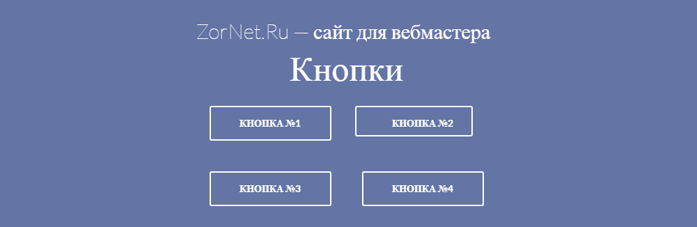
В материале представлены 8 кнопок на чистом CSS, где у каждой кнопки свой оригинальный эффект, который отлично смотрится на любом фоне, будь то светлый или темный. Эти оригинальные кнопки для сайта, которые можно задействовать в дизайне, и второе, чтоб отвечала за конкретный эффект, как скачать или переход на другую страницу и так далее.
На этот раз здесь присутствуют элементы кнопок с трехмерным дизайном, которые идут с тенями, где сразу совершенно под другому аналог выглядит.
HTML
Код
<table id="buttons">
<th colspan="2" class="buttons_hd">
<span style="font-weight: 100; font-size: 30px;">ZorNet.Ru — сайт для вебмастера</span>
<br>
Кнопки
</th>
<tr>
<td>
<button class="btn1 btn">
<span class="btn1_txtn btn_txt">
Кнопка №1
</span>
</button>
</td>
<td>
<button class="btn2 btn">
<span class="btn2_txt btn_txt">
Кнопка №2
</span>
</button>
</td>
</tr>
<tr>
<td>
<button class="btn3 btn">
<span class="btn3_txt btn_txt">
Кнопка №3
</span>
</button>
</td>
<td>
<button class="btn4 btn">
<span class="btn4_txt btn_txt">
Кнопка №4
</span>
</button>
</td>
</tr>
<tr>
<td>
<button class="btn5 btn">
<span class="btn5_txt btn_txt">
Кнопка №5
</span>
</button>
</td>
<td>
<button class="btn6 btn">
<span class="btn6_txt btn_txt">
Кнопка №6
</span>
</button>
</td>
</tr>
</table>
CSS
Код
#buttons {
display: ;
background: ;
margin: auto;
margin-top: 50px;
}
.buttons_hd {
font-size: 50px;
font-weight: 300;
height: 50px;
color: white;
cursor: default;
}
.btn {
margin: 20px;
height: 50px;
width: 175px;
background: none;
font-family: "Lato";
font-weight: 700;
border: 2px solid white;
cursor: pointer;
color: white;
border-radius: 3px;
}
.btn:active {
}
.btn_txt {
text-transform: uppercase;
font-size: 14px;
color: ;
}
/* Les Boutons */
.btn1 {
overflow: hidden;
line-height: 0px;
position: relative;
}
.btn1_txt {
z-index: 100;
}
.btn1:before {
z-index: -1;
margin-top: -20px;
content: "";
background: #AAB6DA ;
position: absolute;
width: 100%;
height: 100%;
left: -115%;
transition: 300ms;
transform: skew(-30deg);
}
.btn1:active {
}
.btn1:hover:before {
left: 115%;
}
/* Button 2 */
.btn2 {
border: none;
position: relative;
transition: 300ms ease-out;
}
.btn2:before {
border-radius: 3px;
transition: 350ms;
border: 2px solid white;
z-index: -1;
content: "";
margin-left: -53px;
margin-top: -16px;
width: 165px;
height: 40px;
position: absolute;
background: none;
}
.btn2:hover:before {
border: 2px solid white;
margin-top: -6px;
margin-left: -18px;
border-radius: 40px;
height: 25px;
width: 100px;
}
/* Button 3 */
.btn3 {
color: white;
transition: 300ms;
}
.btn3:hover {
background: white;
color: #6374A5;
}
/* Button 4 */
.btn4 {
position: relative;
box-sizing: border-box;
overflow: hidden;
transition: 300ms ease-in;
}
.btn4_txt {
z-index: top;
}
.btn4:hover {
color: #6374A5;
}
.btn4:before {
z-index: -1;
margin-left: -65px;
margin-top: -11px;
transition: 300ms;
position: absolute;
background: white;
height: 100%;
width: 0%;
content: "";
}
.btn4:hover:before {
width: 101%;
}
/* Button 5 */
.btn5 {
position: relative;
transition: 300ms;
overflow: hidden;
}
.btn5:hover {
color: #6374A5;
}
.btn5:before {
z-index: -1;
border-radius: 100%;
transition: 400ms ease;
margin-top: 5px;
margin-left: 30px;
background: white;
height: 0px;
width: 0px;
content: "";
position: absolute;
opacity: 0.3;
}
.btn5:hover:before {
height: 200px;
width: 200px;
margin: -75px;
opacity: 1;
}
/* Button 6 */
.btn6 {
position: relative;
margin-left: 25px;
width: 165px;
height: 40px;
border: none;
}
.btn6:before {
border-radius: 3px;
transition: 325ms;
border: 5px solid white;
z-index: -1;
content: "";
margin-left: -47.5px;
margin-top: -16px;
width: 100%;
height: 100%;
position: absolute;
background: none;
}
.btn6:hover:before {
margin-top: 22px;
margin-left: -12px;
height: 0;
width: 55.5%;
border-top: 5px solid white;
border-bottom: 5px solid #6374A5;
border-right: 5px solid #6374A5;
border-left: 5px solid #6374A5;
border-top-left-radius: 0px;
border-top-right-radius: 0px;
}
Когда анимацию можно легко выразить с помощью CSS3, и создать тот самый стиль, который отлично подходит под основной дизайн.
Демонстрация