| Kosten | Суббота, 04 Апреля 2020 | Сообщение 1 |

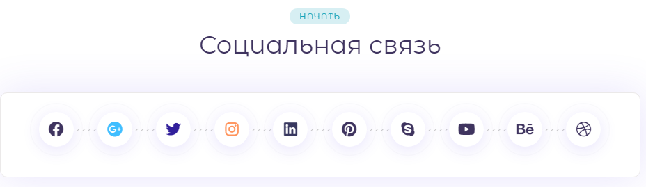
| Не как не представляю современный шаблон без задействования CSS анимация картинки, которая происходит при наведении клика. И вот отличная подборка в оригинальным эффектом, что на одном CSS редко можно встретить. Где вы наводите и происходит реальное волшебство. Также сами кнопки взаимозаменяемые, а значит вы можете поставить те социальные ресурсы, которые более популярны.
И так:

Установка:
HEAD
Код <link rel="stylesheet" href="https://cdnjs.cloudflare.com/ajax/libs/font-awesome/5.11.2/css/all.min.css">
<link rel="stylesheet" href="https://cdnjs.cloudflare.com/ajax/libs/font-awesome-animation/0.2.1/font-awesome-animation.min.css">
<link rel="stylesheet" href="https://cdnjs.cloudflare.com/ajax/libs/twitter-bootstrap/4.1.3/css/bootstrap.min.css">
HTML
Код <section class="trial-block shadow3" id="ContactUs">
<div class="height450">
<div class="section-title text-center">
<span class="badge badge-info">Начать</span>
<h2>Социальная связь</h2>
<span class="section-title-line section-title-line"></span>
</div>
<div class="social-overlap process-scetion mt100">
<div class="container">
<div class="row justify-content-center">
<div class="col-md-10">
<div class="social-bar">
<div class="social-icons mb-3 iconpad text-center">
<a href="/" target="_blank" class="slider-nav-item"><i class="fab fa-facebook"></i></a>
<a href="/" target="_blank" class="slider-nav-item"><i class="fab fa-google-plus"></i></a>
<a href="/" target="_blank" class="slider-nav-item"><i class="fab fa-twitter"></i></a>
<a href="/" target="_blank" class="slider-nav-item"><i class="fab fa-instagram"></i></a>
<a href="/" target="_blank" class="slider-nav-item"><i class="fab fa-linkedin"></i></a>
<a href="/" target="_blank" class="slider-nav-item"><i class="fab fa-pinterest"></i></a>
<a href="/" target="_blank" class="slider-nav-item"><i class="fab fa-skype"></i></a>
<a href="#" class="slider-nav-item"><i class="fab fa-youtube"></i></a>
<a href="#" class="behance slider-nav-item"><i class="fab fa-behance"></i></a>
<a href="/" target="_blank" class="slider-nav-item"><i class="fab fa-dribbble"></i></a>
</div>
</div>
</div>
</div>
</div>
</div>
</div>
</section>
CSS
Код .shadow3 {
background-image: url("http://www.commixturesoft.com/img/shadow3.png");
background-repeat: no-repeat;
}
.height450{height:450px;}
.badge-info {
background-color: rgba(23, 160, 184, 0.17);
color: #17a2b8;
}
.section-title .badge {
margin: 0 0 8px;
}
.badge {
border-radius: 100px;
font-size: 12px;
font-stretch: normal;
font-style: normal;
font-weight: 500;
letter-spacing: 1px;
line-height: normal;
padding: 4px 14px;
text-transform: uppercase;
}
.h1, .h2, .h3, .h4, .h5, .h6, h1, h2, h3, h4, h5, h6 {
color: #3f345f;
}
h2 {
font-size: 36px;
}
.social-overlap {
position: absolute;
width: 100%;
transform: translateY(-50%);
}
.justify-content-center {
-ms-flex-pack: center!important;
justify-content: center!important;
}
.justify-content-center {
-webkit-box-pack: center!important;
-ms-flex-pack: center!important;
justify-content: center!important;
}
.social-bar {
display: flex;
border-radius: 10px;
background: #fff;
box-shadow: 0 0 60px rgba(93, 70, 232, 0.15);
border: 1px solid#ebe9e9;
}
.iconpad {
padding: 12px 0;
width: 100%;
}
.mb-3, .my-3 {
margin-bottom: 1rem!important;
}
.process-scetion .slider-nav-item {
position: relative;
flex-grow: 0;
flex-shrink: 0;
border-radius: 50%;
text-align: center;
background: #fff;
cursor: pointer;
transition: all .4s ease;
}
.social-icons a {
border-radius: 50px;
color: #3f345f;
display: inline-block;
line-height: 52px;
height: 50px;
width: 50px;
box-shadow: 0 5px 25px rgba(93, 70, 232, 0.15);
margin: 15px 15px;
font-size: 22px;
}
a {
text-decoration: none !important;
color: #3f345f;
transition: all 0.3s ease 0s;
}
.slider-nav-item:before {
position: absolute;
content: "";
height: calc(100% + 16px);
width: calc(100% + 16px);
top: -8px;
left: -8px;
border-radius: 50%;
border: 1px solid rgba(132, 132, 164, 0.35);
animation: 1.5s linear 0s normal none infinite focuse;
}
/*socil*/
.slider-nav{
display: flex;
}
.process-scetion .slider-nav-item {
position: relative;
flex-grow: 0;
flex-shrink: 0;
border-radius: 50%;
text-align: center;
background: #fff;
cursor: pointer;
transition: all .4s ease;
}
.slider-nav-item:before
{
position: absolute;
content: "";
height: calc(100% + 16px);
width: calc(100% + 16px);
top: -8px;
left: -8px;
border-radius: 50%;
border: 1px solid rgba(132, 132, 164, 0.35);
animation: 1.5s linear 0s normal none infinite focuse;
}
.process-scetion .slider-nav-item:nth-child(2) {
color: #40beff; }
.process-scetion .slider-nav-item:nth-child(3) {
color: #311f9b; }
.process-scetion .slider-nav-item:nth-child(4) {
color: #ff9259; }
.process-scetion .slider-nav-item:nth-child(5) {
color: #38385f; }
.process-scetion .slider-nav-item:after {
position: absolute;
top: 50%;
left: 100%;
height: 2px;
content: '';
width: 100%;
background: url(http://demo.themenio.com/ico/assets/images/line.png) repeat 0 0;
z-index: 0;
animation: slide 1s linear infinite; }
.process-scetion .slider-nav-item:last-child:after {
display: none; }
.process-scetion .slider-nav-item .ikon {
font-size: 50px;
line-height: 80px; }
.process-scetion .slider-nav-item.active:before {
position: absolute;
content: "";
height: calc(100% + 16px);
width: calc(100% + 16px);
top: -8px;
left: -8px;
border-radius: 50%;
border: 1px solid rgba(132, 132, 164, 0.35);
animation: 1.5s linear 0s normal none infinite focuse; }
@keyframes focuse {
0% {
transform: scale(0.8);
opacity: 1; }
75% {
transform: scale(1.2);
opacity: 0; }
100% {
transform: scale(1.2);
opacity: 0; } }
@keyframes slide {
from {
background-position: 0 0; }
to {
background-position: 40px 0; } }
.shadow-img1{
background-image:url("../img/shadow.png");
background-repeat:no-repeat;
background-position:bottom;
}
.shadow-img2{
background-position: bottom;
background-image: url("../img/shadow2.png");
background-size: 100%;
background-repeat: no-repeat;
}
.slider-nav-item:after {
position: absolute;
top: 50%;
left: 100%;
height: 2px;
content: '';
width: 100%;
background: url(http://zornet.ru/ABVUN/Aba/line.png) repeat 0 0;
z-index: 0;
animation: slide 1s linear infinite;
}
.mt100{margin-top:100px;}
@-webkit-keyframes jello-horizontal {
0% {
-webkit-transform: scale3d(1, 1, 1);
transform: scale3d(1, 1, 1);
}
30% {
-webkit-transform: scale3d(1.25, 0.75, 1);
transform: scale3d(1.25, 0.75, 1);
}
40% {
-webkit-transform: scale3d(0.75, 1.25, 1);
transform: scale3d(0.75, 1.25, 1);
}
50% {
-webkit-transform: scale3d(1.15, 0.85, 1);
transform: scale3d(1.15, 0.85, 1);
}
65% {
-webkit-transform: scale3d(0.95, 1.05, 1);
transform: scale3d(0.95, 1.05, 1);
}
75% {
-webkit-transform: scale3d(1.05, 0.95, 1);
transform: scale3d(1.05, 0.95, 1);
}
100% {
-webkit-transform: scale3d(1, 1, 1);
transform: scale3d(1, 1, 1);
}
}
@keyframes jello-horizontal {
0% {
-webkit-transform: scale3d(1, 1, 1);
transform: scale3d(1, 1, 1);
}
30% {
-webkit-transform: scale3d(1.25, 0.75, 1);
transform: scale3d(1.25, 0.75, 1);
}
40% {
-webkit-transform: scale3d(0.75, 1.25, 1);
transform: scale3d(0.75, 1.25, 1);
}
50% {
-webkit-transform: scale3d(1.15, 0.85, 1);
transform: scale3d(1.15, 0.85, 1);
}
65% {
-webkit-transform: scale3d(0.95, 1.05, 1);
transform: scale3d(0.95, 1.05, 1);
}
75% {
-webkit-transform: scale3d(1.05, 0.95, 1);
transform: scale3d(1.05, 0.95, 1);
}
100% {
-webkit-transform: scale3d(1, 1, 1);
transform: scale3d(1, 1, 1);
}
}
.jello-horizontal {
-webkit-animation: jello-horizontal 0.9s both;
animation: jello-horizontal 0.9s both;
}
.social-bar a:hover i
{
-webkit-animation: jello-horizontal 0.9s both;
animation: jello-horizontal 0.9s both;
}
@media only screen and (max-width: 300px) {
.process-scetion .slider-nav-item
{
height: 30px;
width: 30px;
margin: 15px 10px;
line-height: 28px;
}
}
Вот так самостоятельно можно создать оригинальный набор красивых иконок для сайта с помощью CSS3 и безусловно анимации при наведении.
Демонстрация
| | Страна: (RU) |
| |